Menus are a navigational tool that helps visitors find what they are looking for in a timely manner. While most websites are naturally responsive nowadays, sometimes you may need to go a bit further to help mobile users. And the SlickNav plugin is perfect for the job.
With it, you can build highly customizable mobile-friendly menus in minutes. These not only help ensure that your website is easy to navigate, but they also help it look good. There are even options to add your logo to the menus to improve branding.
Today, I will demonstrate how to create a stylish SlickNav menu in WordPress.
Why A Mobile Navigational Menu Matters
As of May 2021, mobile traffic makes up 55.31% of all internet traffic and is continuing to grow year over year. Thus, ensuring your website is ready for mobile visitors is essential.
One of the biggest problems mobile users face on a website is the menu. Let’s face it, sometimes they are just not sized properly for mobile devices, and that makes it difficult to navigate the website. Customizing your menus for mobile users is a great way to improve the experience.
And since menus are interacted with by almost all users, it’s a great marketing area.
One of the biggest mistakes new website developers make is not branding their content. The power of branding is how large companies stay dominant, and adding your logo to the menu is one way to do it. It helps build brand recognition and can show off your creative side in one swoop.
Customizing the menus is one of the first steps to achieve a mobile-friendly WordPress site.
How to Customize WordPress Menus with SlickNav
Step 1: Install SlickNav
The SlickNav Mobile Menu plugin is a very simple customization tool for WordPress menus. With it, you can fully customize the appearance of the menu, create submenus, and even add a search field. And most importantly, it’s easy to use.
In just a few minutes, you’ll have a fully functioning WordPress menu that’s ready to impress visitors.
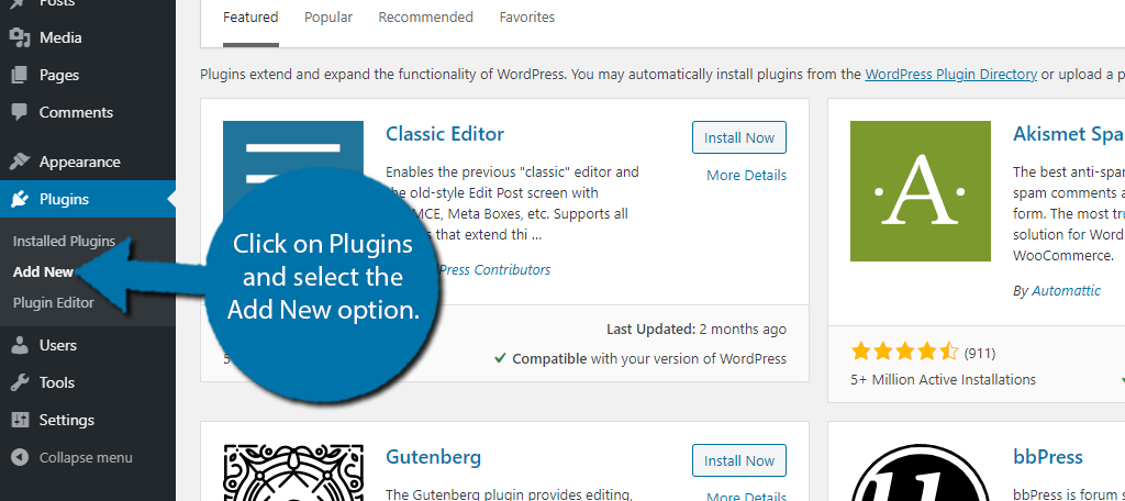
Let’s start by clicking on Plugins and selecting the Add New option on the left-hand admin panel.
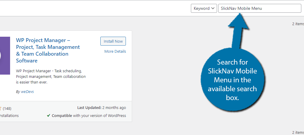
Search for SlickNav Mobile Menu in the available search box. This will pull up additional plugins that you may find helpful.
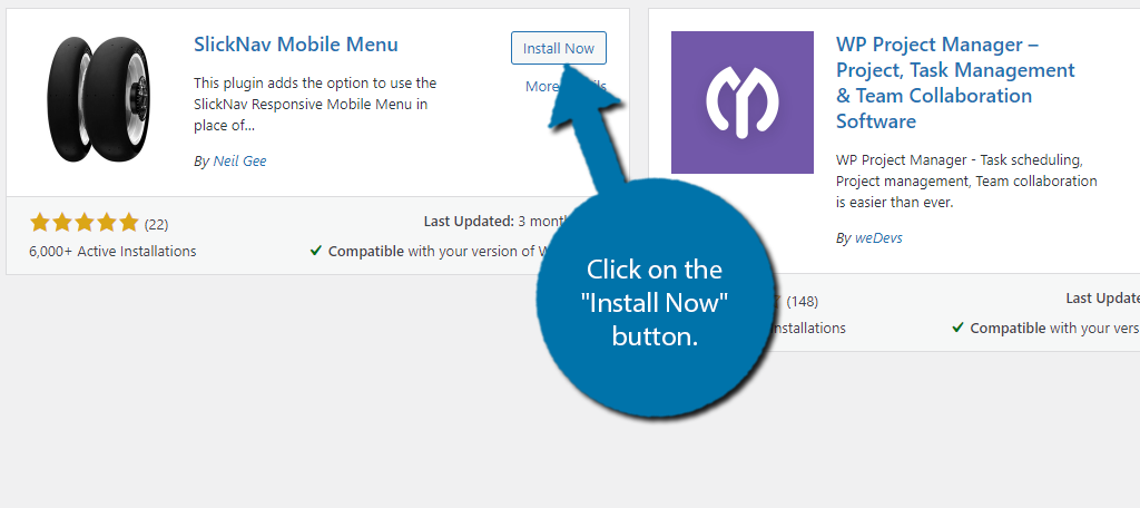
Scroll down until you find the SlickNav Mobile Menu plugin and click on the “Install Now” button and activate the plugin for use.
Step 2: Locate the Menu CSS Class or Menu ID
Before you get started with the actual customization process, you are going to need a specific piece of information to tell SlickNav what menu you want to edit. The plugin allows you to use either the Menu CSS Class or the Menu ID.
The easiest one to obtain is the Menu ID, which I will now outline.
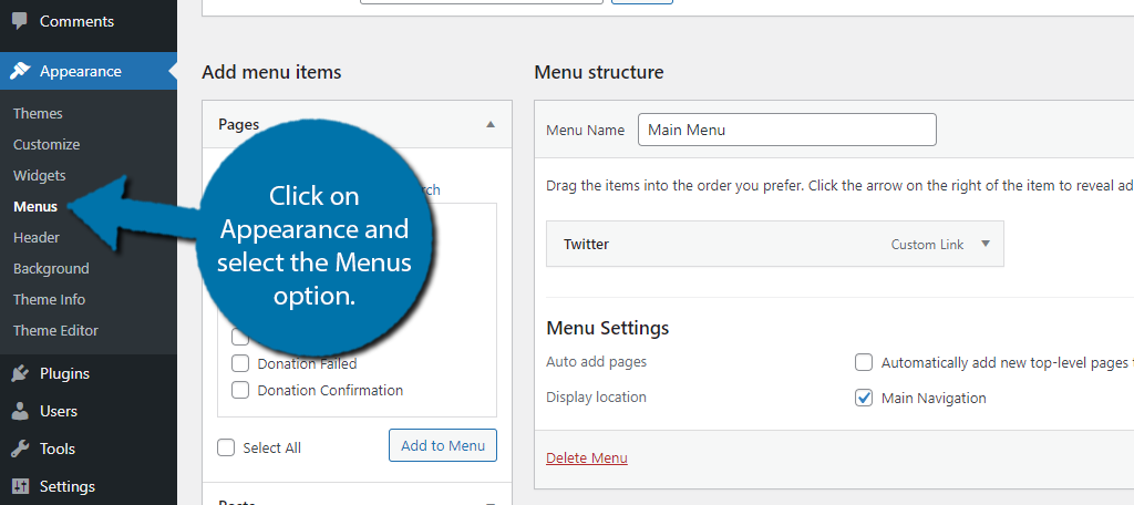
Click on Appearance and select the Menus option.
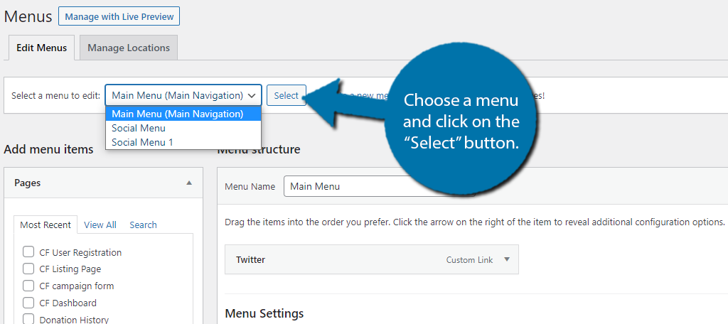
At the top, use the drop-down to select which menu you want to edit. Click on the “Select” button.
Look at the URL on the page, the last number is the Menu ID. Copy it for the next step.
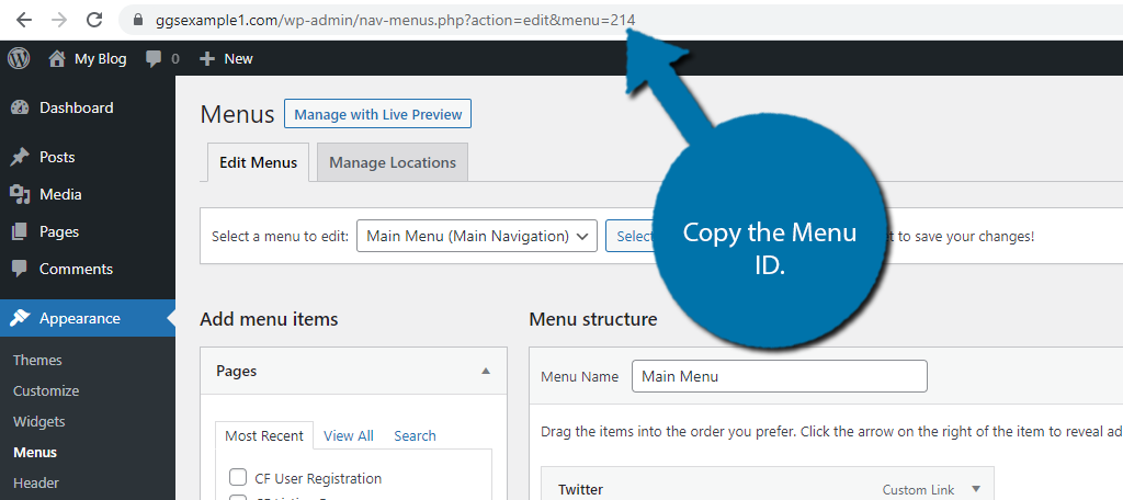
If you want to edit multiple menus, repeat this process to obtain the necessary Menu IDs.
Before moving on, it’s important to understand that the plugin customization page only changes the appearance of the menu. To actually add new items to it, you will need to use the Menus area of WordPress.
Step 3: Customize the Menu
With the Menu ID ready to go, you can now start customizing. The process is very straightforward, but unfortunately, the plugin lacks a preview option. Thus, the only way to actually see it is after you click the “Update” button.
The only issue is that it will be on your live website, so it’s not recommended to go one change at a time. Instead, I’d recommend going through the settings then see what the finished product looks like. Afterward, you can go back and make edits.
If your website is busy, I’d recommend doing this during the off-hours.
To begin, click on Settings and select the SlickNav Menu option.

First, paste the Menu ID into the first textbox. If you have multiple menus, you can separate them with a comma, but keep in mind they will all look the same. Though, this is a great way to keep everything consistent on your website.
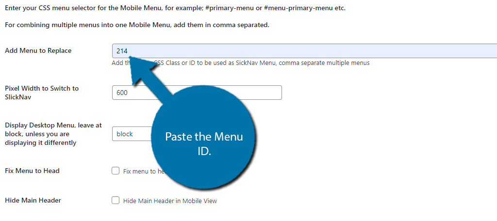
The settings list is pretty comprehensive, so I will cover the key features. That said, I strongly encourage you to edit each setting as necessary to get the best results.
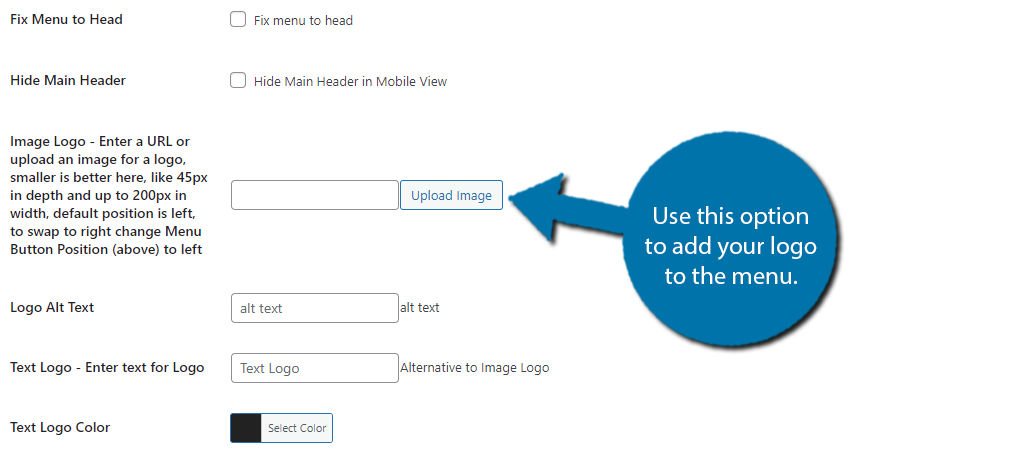
Use the Image Logo option to upload a picture of your website’s logo. The plugin recommends the image to be 45px in-depth and up to 200px in width.
Below this, you will find options for the logo alt text, so make sure to fill it in.
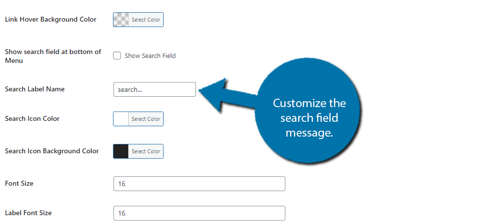
You can customize what the search field will say with the Search Label Name option.
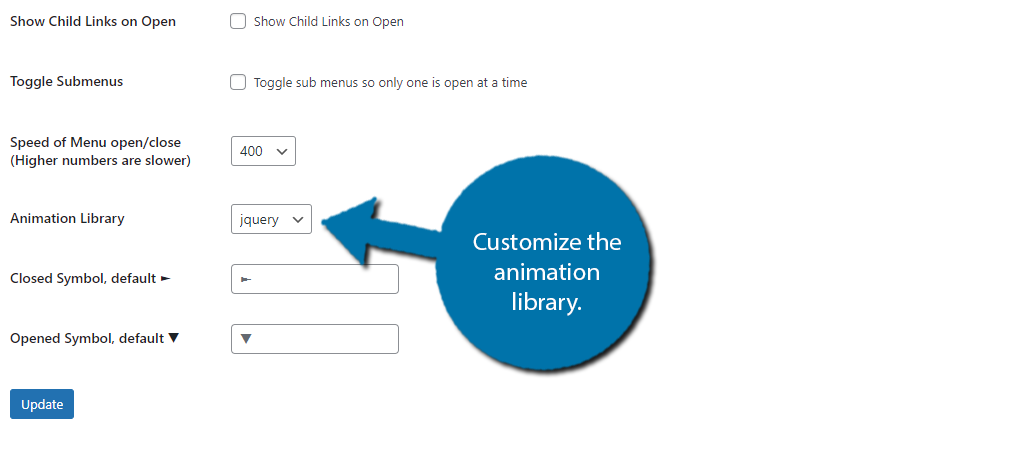
Choose which animation library to use. jquery or velocity. If you’re unfamiliar with these, jquery is very common and works perfectly on just about every site. Velocity uses the same jquery API, but it is significantly faster.
Once you have gone through all of the settings and are completely satisfied, click on the “Update” button.

The changes will now be applied to the menus on your website, which you can now view. If you are unhappy with the appearance, you can go back to the settings page and make adjustments.
Congratulations on making mobile-friendly menus with SlickNav.
Make Your Entire Website Mobile-Friendly
Creating a mobile nav menu in WordPress is only one aspect of running a mobile-friendly site.
For instance, have you ever thought about how close together some buttons are? Probably not, but you should. This can be a nightmare for mobile users with larger fingers.
The end result is them accidentally clicking the wrong button, and it’s a surefire way to get them to leave.
Even if your buttons are responsive, placing them very close together defeats the purpose.
Another thing to consider is if your sidebar should be visible on mobile. The screen is quite small, thus, forcing visitors to have a sidebar present can eat up screen space. It can even lead to some awkward-looking pages and posts.
The bottom line is that just relying on responsive design is not enough. You have to consider some of the smaller details and how they fit into the overall mobile experience.
Help Visitors Find Your Content
Getting visitors onto your posts and pages is hard enough. And making the most out of those visits separates the successful websites from the failures.
Menus play an instrumental part in that first impression.
Customers want to find what they are looking for in seconds, and that’s what navigational menus are designed for. Thus, they need to be a priority in creating an easy-to-navigate website. It’s one of the biggest problems with new websites, and many developers often forget about mobile users.
Using responsive tools is great, but they are just not enough sometimes. Instead, you need to manually edit and customize certain elements for the best experience.
Do you think the default WordPress navigation menu looks good on a mobile device? Did you find the customization options easy to use?

