Have you ever wanted to view your website from a mobile device during development? If so, you’ll be pleased to know you can with the Mobilook plugin. With it, you can simulate what your website will look like on a variety of popular screen sizes including smartphones and tablets.
It’s a helpful tool that helps you judge the mobile side of your website. This has become a mandatory concern ever since Google started mobile-first indexing. Essentially, Google will index the mobile version of your website first, thus if it’s not good, your ranking will tank.
Today, I will demonstrate how to perform a mobile-friendly test with Mobilook.
Why Mobile Users Matter
As of May 2021, mobile users make up 55.31% of internet traffic. And it has been growing consistently year-over-year. Thus, mobile users are the most important userbase to most website owners.
And thanks to the Google mobile-first indexing initiative, website developers can’t ignore it.
Google runs a test to determine if your website is mobile-friendly, and if it passes, you’re good to go. Thus, even if you have a terrific desktop website, you could cripple your ranking with a poor mobile version. But search engines are only half of the concern.
You must also consider the mobile visitors themselves.
Let’s face it, an unresponsive mobile site in 2021 is just unacceptable. In fact, you really have to go out of your way to make an unresponsive website today. This includes having buttons that are hard to tap, images that are too large to view, and slow load times that are unbearable.
A bad mobile experience will make sure customers avoid your website on both mobile or desktop.
How to Create A Mobile View of Your Website With Mobilook
Step 1: Install Mobilook
Mobilook is an extension of the Google DEVTOOL that allows you to check how responsive your pages are on the most popular devices. It’s simple to set up and highly effective at uncovering problems. It’s also worth noting the Pro version of the plugin.
With it, you can actually run Google mobile optimizer test, which allows you to view exactly how Google views the page. It will tell you if they deem the page mobile-friendly or not. It’s incredibly useful to see if your website is not up to snuff.
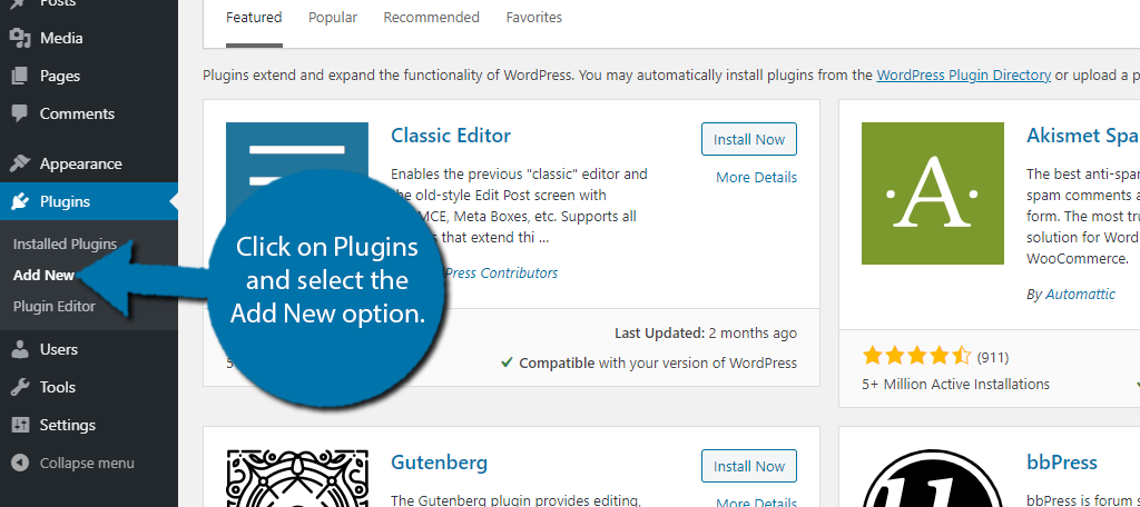
Begin by clicking on Plugins and selecting the Add New option on the left-hand admin panel.
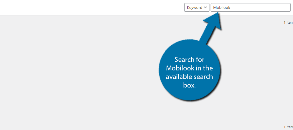
Search for Mobilook in the available search box.
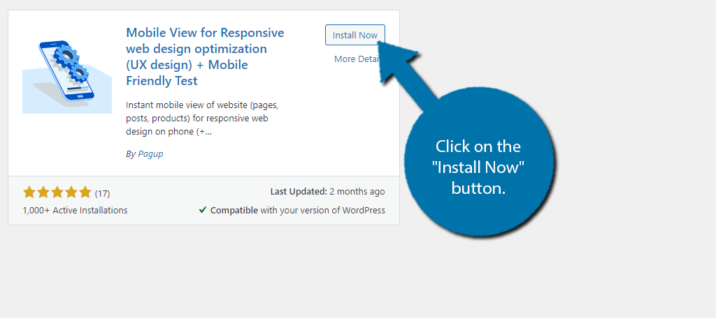
Find the Mobilook plugin and click on the “Install Now” button and activate the plugin for use.
Step 2: Connecting with Mobilook
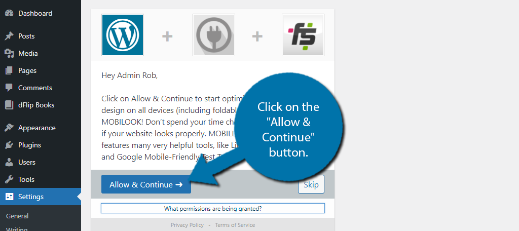
Upon activation, you will be asked if you want Mobilook to begin optimizing your responsive pages. It’s recommended to click on the “Allow & Continue” button. However, you can skip this for now and do it later, as the tutorial will assume you gave permission.
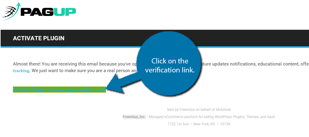
You must then check your email associated with your admin account and click on the verification link.
This will bring you back to WordPress, where you will see that the activation process is complete. You’re now ready to use the plugin.
Step 3: Configure the Settings
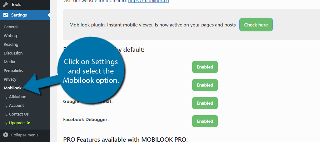
On the left-hand admin panel, click on Settings and select the Mobilook option.
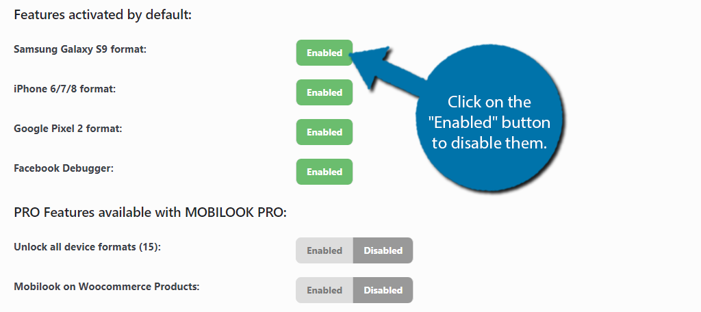
The free version of the plugin allows you to enable or disable some features. These include Samsung Galaxy S9 format, iPhone 6/7/8 format, Google Pixel 2 format, and the Facebook Debugger. By default, all of these are enabled and recommended to stay so.
To turn it off, simply click on the “Enabled” button to disable them.
There are several PRO features that you can toggle on and off below, but they are only accessible if you upgrade. This tutorial will only deal with the free version.
Step 4: Mobile View In WordPress
With the settings out of the way, it’s time to finally use the mobile view in WordPress. This can be accessed directly from an editor on any post or page.
Go to any post or page in WordPress and scroll down to the Mobilook section.
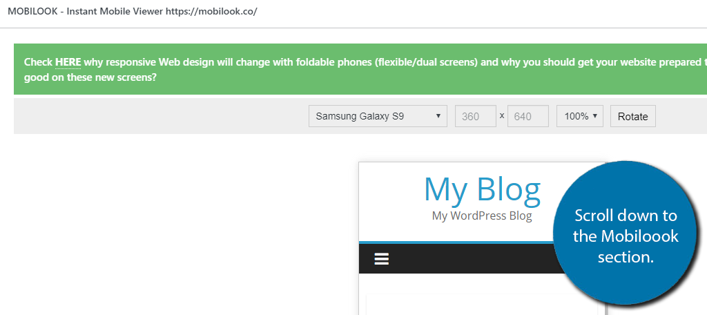
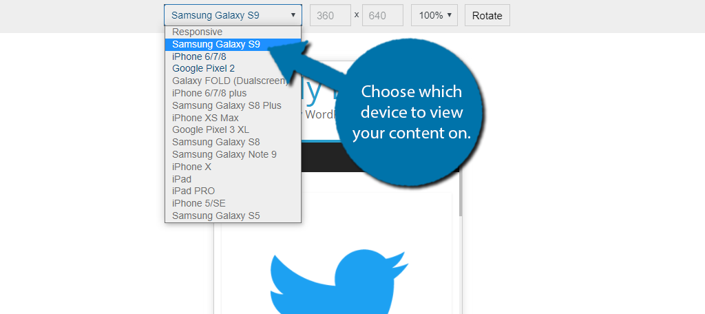
At the top, you can select which device to view your post or page on. Next to this, you can view the dimensions of the screen.
Note: On the free version, only the first three options are available.
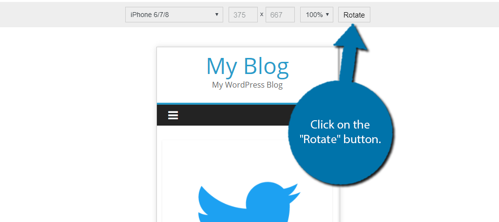
Click on the “Rotate” button to change between portrait (vertical) or landscape (horizontal) view.
At the bottom of this section, you will find tools to further help you identify mobile problems. These include the Facebook Debugger, Linkedin Debugger, Google Mobile-Friendly Tool, and Viewport Opt (Mobile SEO).
Only the Facebook Debugger tool is free. It allows you to identify any problems related to your blog post previews on Facebook. It’s a useful tool if you regularly use Facebook to share posts.
Congratulations on setting up and learning to use the Mobilook plugin.
Alternative Tools
Many WordPress developers may not be a fan of dedicating a plugin to this purpose. Luckily, there are plenty of free tools to consider using.
Here are a few of the best:
Chrome DevTools
Chrome DevTools are another great free resource you should be taking advantage of. With it, you can simulate what any website looks like on a mobile device. You can even simulate using the website by configuring the cursor to be a larger round shape, like a finger.
Thus, not only can you view your website, you can test how it runs. And you are not limited by devices. Instead, you can manually enter the dimensions into the tool.
Therefore, you can actually test any device’s viewable dimensions with this responsive website tester.
Google Mobile-Friendly Test

While Google Mobile-Friendly Test won’t give you a full mobile view of your website, it does tell you something critical for success. And that is what Google thinks of your website.
It will tell you if the page is mobile-friendly or if it isn’t. If it isn’t, Google’s tool will provide reasoning as to why.
And yes, this is the same test that is included in the Pro version of Mobilook. It’s a free tool on its own that provides a great advantage for development.
Can’t I Just Use My Own Smartphone?
Absolutely! In fact, it’s a great test.
However, not every smartphone is the same size. One of the biggest problems testing on one device is that developers tend to only consider that option. Instead, you need to consider every possible screen size.
While tablets, make up the smallest bit of traffic, it’s worth noting that they are much larger than smartphones while also come in a variety of sizes. Thus, a single smartphone is not as much help when developing for a larger audience.
Responsive Design Is the Only Option
There is some good news, almost everything within WordPress is responsive by default. So, your website should look great on any device no matter what.
The reason that testing is important is that there are some plugins that are not natively responsive. While they are rare nowadays, they exist, and they can cripple your rankings. There are also some customization options that help improve the mobile experience.
For instance, one of the most common in WordPress is to disable the sidebar on mobile devices. The screens just are not big enough to warrant a sidebar being present on every page.
How easy did you find Mobilook to use? Do you think WordPress should have a mobile view built-in by default?

