Do you want to create a stylish comment section for your website? The comment section is where all of your visitors will discuss your content and leave feedback. The default comment section is extremely plain and has no style. For this reason, it is important for web developers to take the time to fully customize their comment sections.
As with all forms of styling in WordPress, this method will revolve around CSS and HTML, but don’t worry it is approachable for beginners as well. If you have your comments section disabled, you may want to consider enabling it again. Today, I will demonstrate how to style your comment section and different designs you can use in WordPress.
Why is Styling My Comment Section Important
You may be a new website that has only had a handful of comments and does not quite see the value of the section or simply does not know how to handle them. You may also be one of the many websites that disable their comment section to avoid the negative comments that are a problem for most comment sections. Regardless, comment sections are an important part of any website and help build a community environment.
If you are not receiving many comments, then it may be due to your comment section not looking good. Yes, people actually care about what the area looks like. Creating a design that matches the rest of the website and helps make all of the comments stand out is extremely important. Not only is styling important, but allowing more avatars is another way to improve the comment section.
How to Create a Stylish Comment Section in WordPress
Today, I will demonstrate how to style your comment section and different designs you can use in WordPress. The designs you pick should blend in with your current theme and you can fully customize the color options. Keep in mind there are hundreds to choose from and I will just be sharing some popular ones from around the web.
If you are not experienced in coding, don’t worry. There are two things to keep in mind. The first is that copying and pasting code that is not written for your theme will most likely not work. For example, taking comment styles for the Twenty Twelve theme and using them on a website that has Poseidon will have zero results. This is because each theme has different naming conventions. You need to be aware of what your theme’s naming convention is. The second is that you will only need to edit the color options and font options once you get it working.
For reference, all of the examples will be written for the Twenty Twelve theme.
Alternating Comment Background Colors
One of the more popular comment design choices is to have alternating colors in the background. This helps visitors distinguish the comments from one another. It is a good rule of thumb to pick colors that are present in your theme.
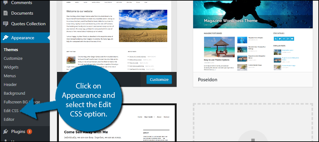
On the left-hand admin panel, click on Appearance and select the Edit CSS option.
Click on the Additional CSS option.
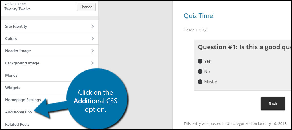
Copy and Paste the following code into the appropriate text box:[ht_message mstyle=”info” title=”” show_icon=”” id=”” class=”” style=”” ].commentlist .even .comment {
background-color:#c0c0c0;
}
.commentlist .odd .comment {
background-color:#ffd700;
}[/ht_message]
Keep in mind that if you are not using the same theme, it will not work. If you need extra support, check out your theme’s support page. You should be able to see the changes as you add the code.
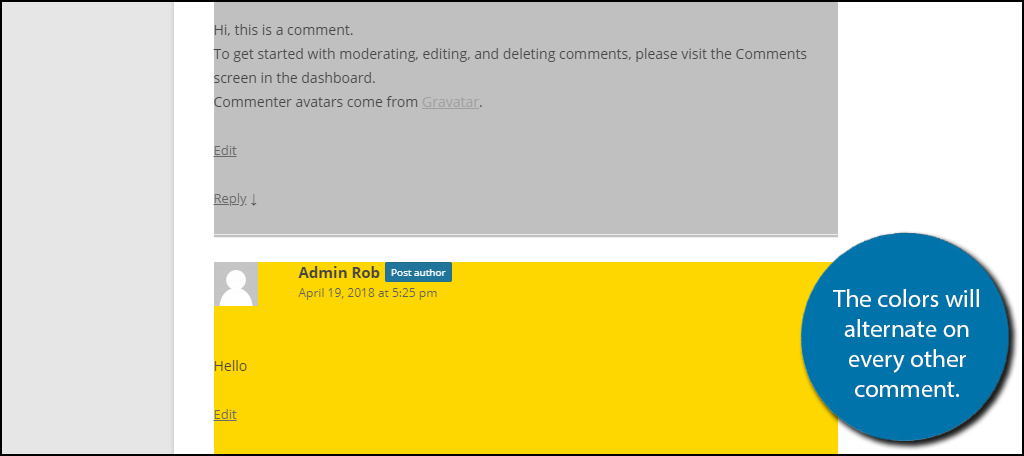
You can change the colors to whatever you want. Here is a list of the CSS color codes. Make sure that you can still read the comment after the color is applied. Click on the “Publish” button to save the changes.
Styling the Author Name Field
Another improvement for the comment section is to make it easy to tell who wrote the comment. Adding a different colored background for the comment’s author information can do that.
Copy and paste the following code into the appropriate text box:[ht_message mstyle=”info” title=”” show_icon=”” id=”” class=”” style=”” ].comments-area article header {
margin: 0 0 48px;
overflow: hidden;
position: relative;
background-color:#006400;
color:#FFFFFF;
padding: 10px;
}[/ht_message]
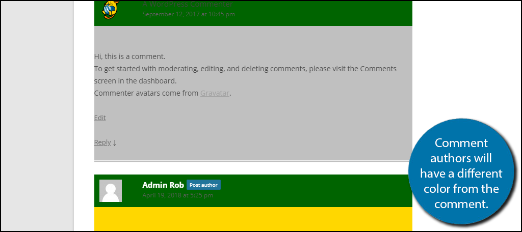
Once again make sure the author name and information is visible. Click on the Publish button to save your work.
Styling Buttons on Your Comments
Most comment sections have multiple buttons in them. They generally include an Edit, Reply, and a Cancel Reply Button. The Cancel Reply button would only be visible when leaving a reply.
Here is the code for the Reply button:[ht_message mstyle=”info” title=”” show_icon=”” id=”” class=”” style=”” ].reply {
float:right;
margin:0 10px 10px 0;
text-align:center;
background-color: #000000;
border:1px solid #55737D;
border-radius:3px;
padding:3px;
width:50px;
box-shadow: 1px 1px 2px 2px #4f4f4f;
}
.comment article {
padding-bottom:2.79rem;
}
a.comment-reply-link,
a.comment-edit-link {
color: #FFFFFF;
font-size: 13px;
font-size: 0.928571429rem;
line-height: 1.846153846;
text-decoration:none;
}
a.comment-reply-link:hover,
a.comment-edit-link:hover {
color: #f6e7d7;
}[/ht_message]
Here is the code for the Edit button:[ht_message mstyle=”info” title=”” show_icon=”” id=”” class=”” style=”” ]
a.comment-edit-link {
float:left;
margin:0 0 10px 10px;
text-align:center;
background-color: #000000;
border:1px solid #55737D;
border-radius:3px;
padding:3px;
width:50px;
box-shadow: 1px 1px 2px 2px #4f4f4f;
}[/ht_message]
Here is the code for the Cancel Reply button:[ht_message mstyle=”info” title=”” show_icon=”” id=”” class=”” style=”” ]#cancel-comment-reply-link {
text-align:center;
background-color: #000000;
border:1px solid #55737D;
border-radius:3px;
padding:3px;
width:50px;
color:#FFFFFF;
box-shadow: 1px 1px 2px 2px #4f4f4f;
text-decoration:none;
}[/ht_message]
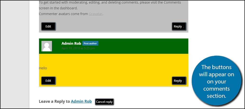
Click on the Publish button to save your work.
Make Sure Everything Matches
The point of styling your comment section is to make it look awesome. The issue is when it doesn’t match the rest of your website. It might seem out of place or maybe the rest of your website needs to be styled. In either case, you need to make sure everything matches and that nothing stands out or looks bad.
The biggest factor that can lead to this is color choice. I recommend only using colors from your theme or similar ones. It also cannot be stressed enough, make sure all text is visible. This is one of the most common errors on websites today and should not happen.
Which designs have you uses? Do you think your comment section looks better now?
