Mobile users make up 52.2% of all website traffic, and the number is continuing to grow. And yes, that is a majority. This means websites need to make sure the mobile version of their website is up to snuff. However, it can be tricky to view the mobile version of your website from a desktop.
Thankfully, there are multiple ways to do so, and none of them are particularly difficult. Today, I will demonstrate different methods to view the mobile version of your WordPress website.
Why View the Mobile Version of Your Website?
All major website changes are typically made from a desktop, which means the changes you are viewing can only available from that point of view. To see how the changes affect the mobile view, you need to actually look at that version of the website.
For example, let’s say you add a new checkout button to your website. Customers need to click on this button to make a purchase. However, what if the button is not properly sized on your mobile site?
This could mean that it is too small to tap on a smartphone or so big that it makes the pages look terrible. Simple mistakes like this can be avoided if you view a page in the mobile version.
However, switching to the mobile view of your website is not obvious to beginners, but these methods will show you how to do so.
Method 1:WordPress Theme Customizer
I will be starting off with the built-in WordPress method. The WordPress Theme Customizer is a tool used to tweak the appearance of your theme and this, of course, includes the mobile version of your website. Thus, the tool can also be used to view this version.
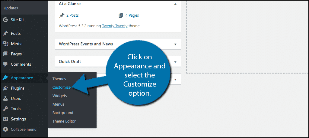
On the left-hand admin panel, click on Appearance and select the Customize option.
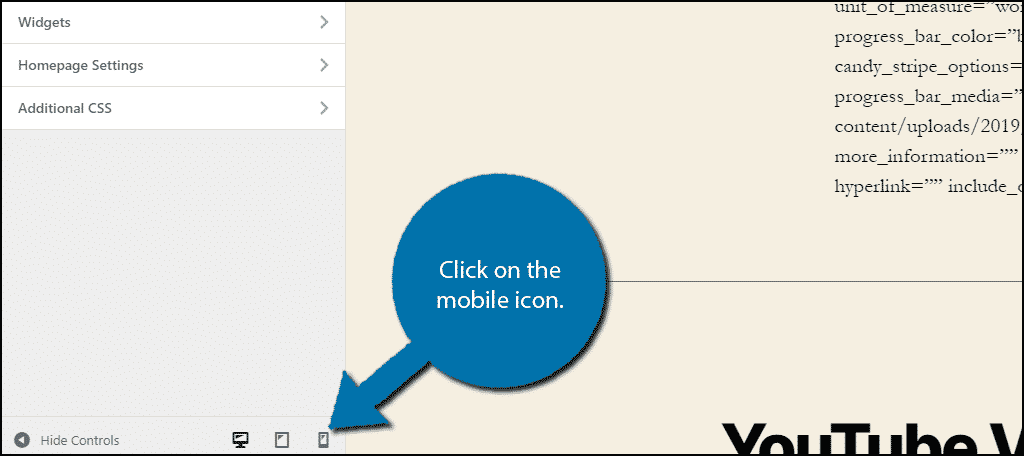
On the bottom of the left-hand side, click on the mobile icon to view the mobile version on the desktop.
Note: Depending on what theme you are using, the view may be slightly different. However, the process should remain identical.
Upon doing so, you will be viewing the mobile version.
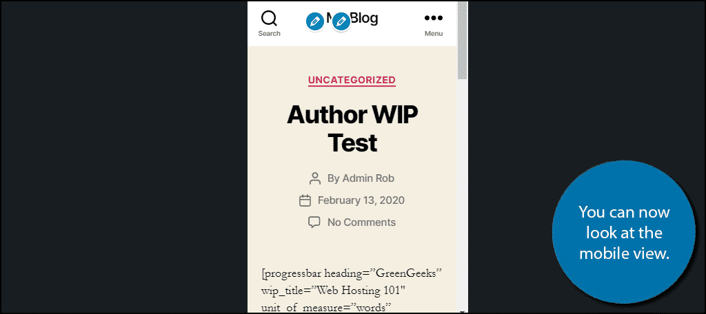
If this is your first time using the theme customizer, do not worry about the blue pencil icons. These are only visible to you and will not be seen by visitors.
Method 2: Google Chrome
Google Chrome is the world’s most popular web browser with a staggering 67.63% market share on desktop. It has many features that other browsers lack and the additional developer tools it offers are some of the more useful.
You can view the mobile version of any website, not just WordPress, on a Google Chrome browser in just a few easy steps.
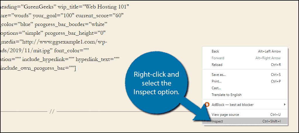
On any website in a Google Chrome browser, right-click and select the Inspect option.
Click on the Toggle Device Toolbar option.
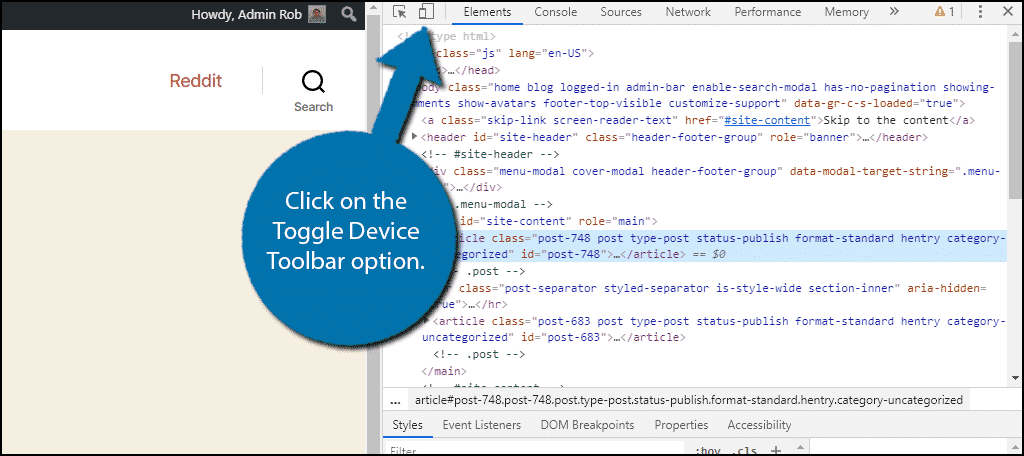
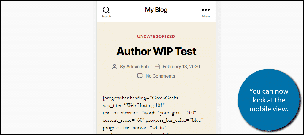
Upon doing so, you will immediately be viewing the mobile version of the website you are on.
At the top of this view, there are a few settings you can change to see different things.
For example, by default, the view is set to Responsive, meaning it will resize according to the device it is being viewed on. However, if you click on this option, you will notice that some of the most popular phone models can be selected as well. If you select one of these, it will simulate that device for specific visitors and what they will see.
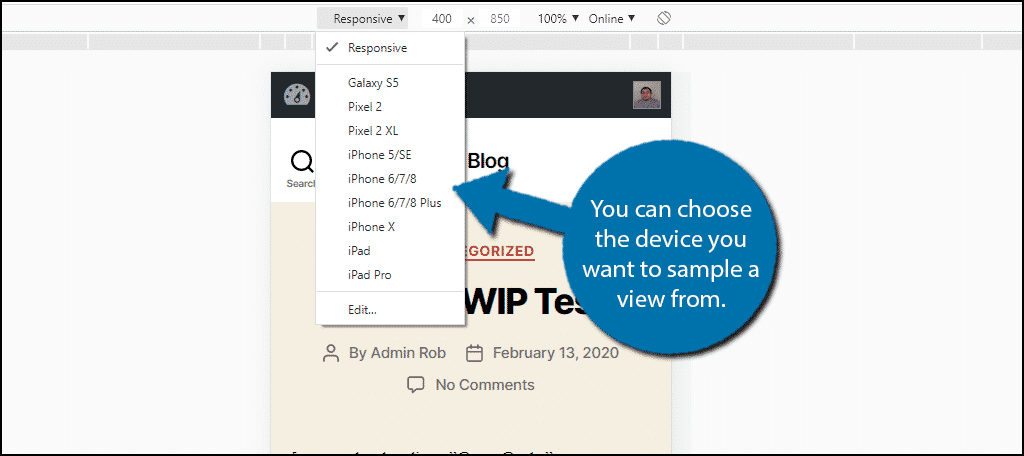
This is extremely helpful if you are trying to troubleshoot a problem on a particular device.
Note: Firefox, Safari, and Microsoft Edge all have a similar feature within them. So do not feel like Chrome is the only choice.
Method 3: Use the Page-oscope
If you are looking to get a more realistic viewing of a website page on a specific device, then the Page-oscope tool is exactly what you are looking for. This is a tool that allows you to view a website on a phone emulator.
To begin, visit the Page-oscope website. Enter the URL of the website you want to view and select up to two different phones to view it on. Click on the “Run Test” button when all of the information is selected.
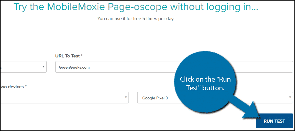
The tool will now load that website on the devices and you should see a side by side view.

The tool is free to use up to 5 times a day without logging in, so be sure to take advantage of it. However, if you wish to use it more, you will need to make and an account and log in.
Note: If you use the Opera browser, there is actually a built-in phone emulator that you can fully interact with. It’s definitely the most advanced tool available from a web browser, so make sure to give it a try if you are a fan of what this tool can do.
Method 4: Window Resizer Extension
The Window Resizer Extension for Google Chrome is a great tool to consider using as well. The tool allows you to pick out a screen size. And what makes this unique is that it allows you to rotate the view. This is a great tool when you want to test out a change on a sideways display.
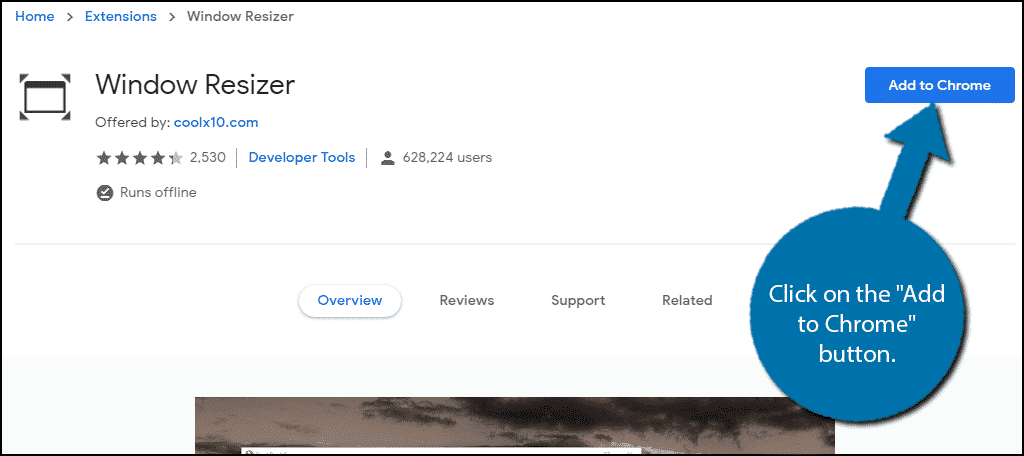
Locate the Window Resizer Extension and click on the “Add to Chrome” button.
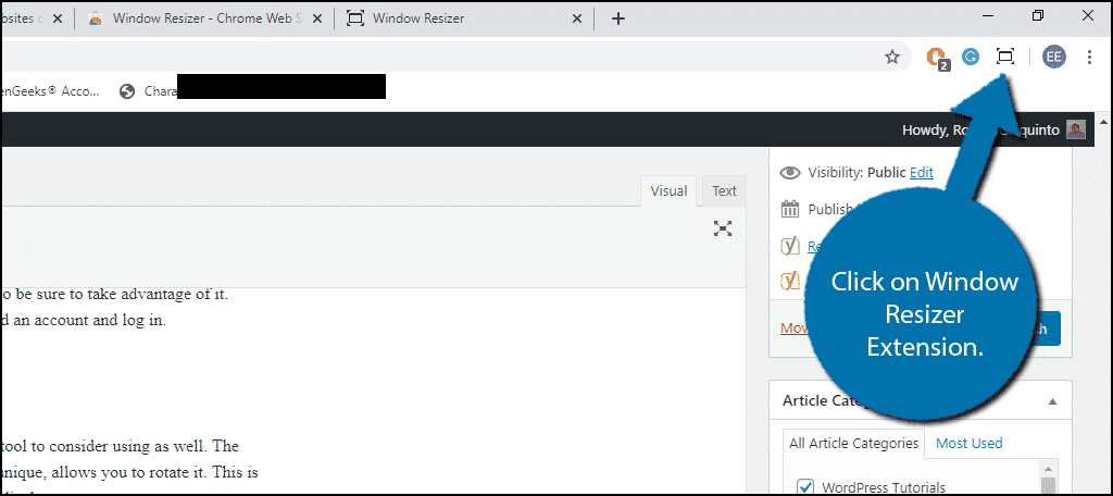
Click on the “Add Extension” button and you’re ready to go. Now go to the website you want to view as a mobile site and click on the icon for the extension on the top right of the browser.
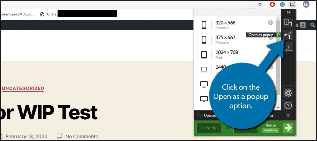
This is not necessary, but I recommend clicking on the Open as a popup option. This will open the current tab you are on as a popup that you can resize.
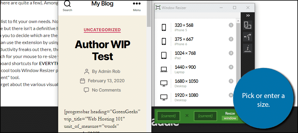
The extension has some of the more popular phone dimensions preset, but the most useful feature is actually the custom option at the bottom. This allows you to enter any type of size, which makes it perfect for checking your website on the various smartphones and tablets available.
Once you select a size, the popup will change accordingly.
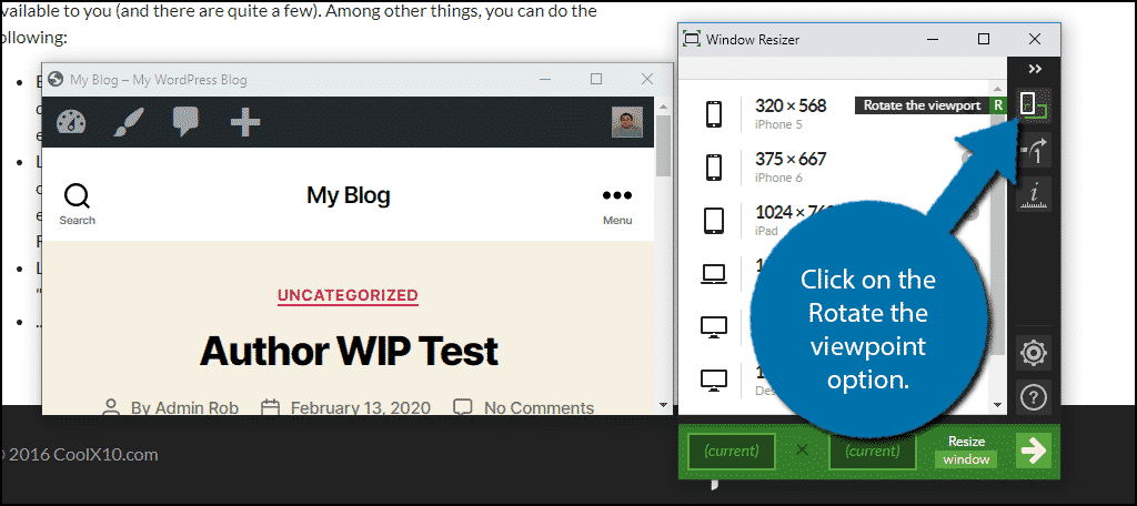
You can rotate the view by clicking on the Rotate the viewpoint option.
This is a very useful tool for developers and it is completely free to use, so take advantage of what you can do on it.
Mobile First
Making a mobile-friendly website should be the first thought by any web developer. Odds are the majority of your traffic will come from mobile users and this is especially true for business sites.
For example, if you run a restaurant, it is extremely common for customers to use their phones to place an order while they are on their way. Or if they are simply looking for a store near them. These kinds of searches are predominantly done on mobile devices.
And it’s not even just the users of which you need to be aware. Google adopted the Mobile-first Indexing practicing back in July 2019. This means that search engine bots are going to index mobile pages first. Thus, you can hurt your SEO significantly if your website is not mobile-friendly.
The bottom line is that mobile users are going to make up a significant portion of your visitors, so make sure your website is ready for them.
Which method do you use to view your mobile version? Have you ever had to make a change to help mobile users?
