A “sticky menu” ensures that your website navigation is always visible. When navigation is placed at the top of a page, it disappears as soon as a visitor scrolls down.
The first attempt at fixing that problem was the introduction of frames. Luckily we have progressed beyond clunky frame technology and we can now implement elegant navigation that stays in one place.
We’re going to use the Sticky Menu (or Anything!) on Scroll plugin to stick our navigation. That name is a mouthful, so to keep things simple, I’ll refer to the plugin as “Sticky Menu.”
What are Sticky or Floating Menus?
Before we start, we should talk about terminology for a moment. Both “sticky” and “floating” are used to describe a page element that does not move when the page is scrolled.
If those words seem contradictory, it’s because they are. It’s hard to envision something “sticky” floating around. But an argument can be made for either term, and both are commonly used, so we’ll use them here interchangeably.
Installing the Sticky Menu Plugin
Log in to your WordPress admin panel.
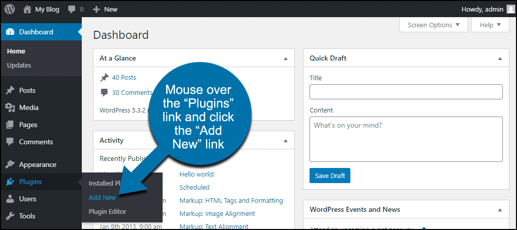
In the left column navigation, mouse over the “Plugins” link and click the “Add New” link.
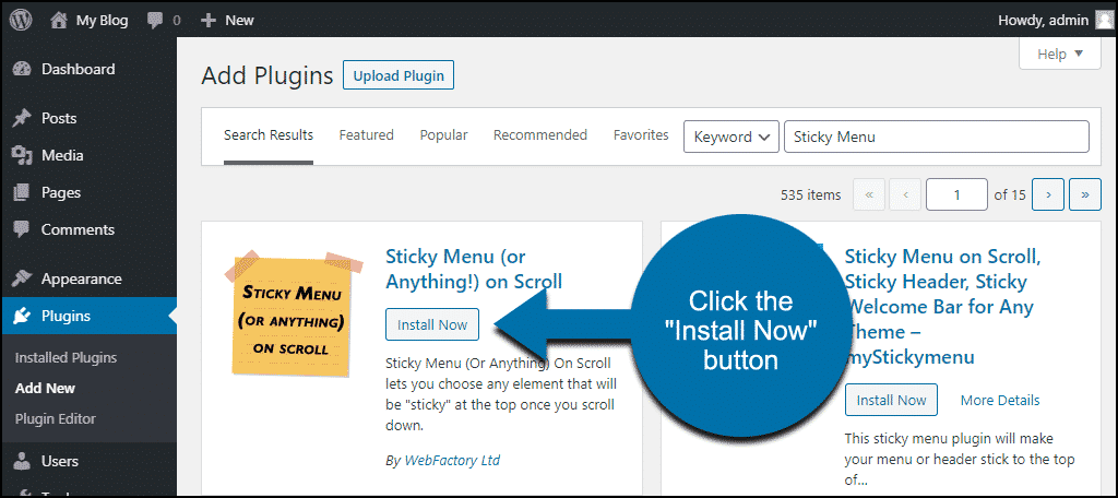
In the “Search plugins…” box, enter “Sticky Menu.”
Once you have located the plugin, click the “Install Now” button.
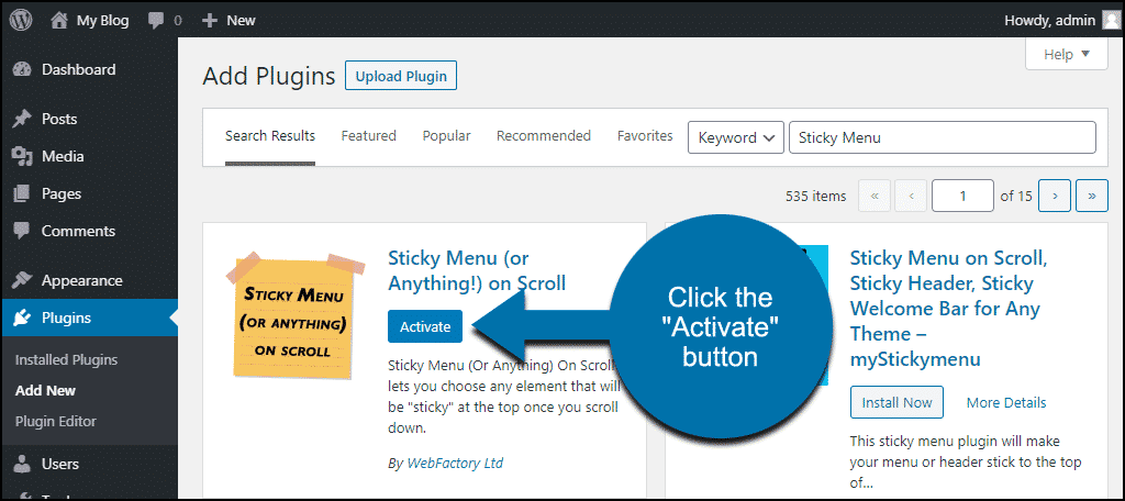
Click the “Activate” button.
How Sticky Menu Works
The plugin makes a page element sticky by using the element’s CSS selector. It doesn’t work directly on menus or widgets (that would be cool though, for any plugin developers out there). But it’s possible to configure your own sticky navbar, menu or widget.
We’ll have to do some digging to find the CSS selector for the page element that we want to stick. But because the plugin works the way it does, it’s more flexible than a point-and-click version.
Finding CSS selectors on a page could be a tutorial in itself. I can’t cover the entire topic here, so we’ll use a quick and easy way to find CSS selectors.
Our example uses Google Chrome “DevTools.” Other browsers may differ, but most have a similar tool.
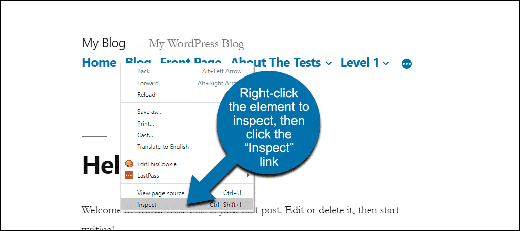
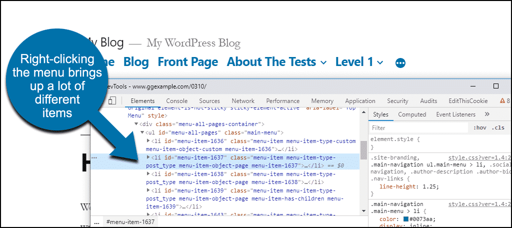
To access DevTools for a particular element, right-click it on the screen. Mac users will use CMD click.
I want to know the CSS selector for the menu. That’s what I want to “stick.” So I’ll right-click on the menu and click the “Inspect” link.
A DevTools window will open in a separate window, or as a panel at the side or bottom of the browser window.
As you can see here, there are many different CSS classes highlighted. A menu is made up of a lot of parts, and what DevTools shows depends on where you click.
So Which CSS Class Do We Want?
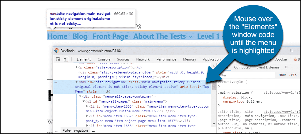
You’ll notice as you mouse over lines of code in the “Elements” window, the corresponding areas are highlighted on the page.
So lets mouse over the “Elements” window code until our menu is highlighted.
Okay, there it is, but there are a lot of CSS selectors attached to it. There’s a CSS ID, and three or four CSS classes.
But there’s also another area of DevTools that will guide us toward what we’re looking for.
The “Styles” section on the right tells us that when we’re hovered over the nav code, .main-navigation is the class.
So that’s what we’ll use.
You may have to do a bit of trial and error when sticking complex page elements that use several CSS classes or IDs. But in this case, we can be pretty certain that .main-navigation will do the trick.
Configuring Sticky Menu
Okay. let’s add the .main-navigation selector to the plugin configuration and see what happens.
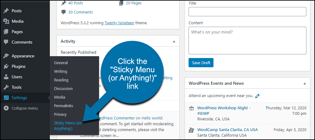
In the left column navigation, mouse over the “Settings” link and click the “Sticky Menu (or Anything!)” link.
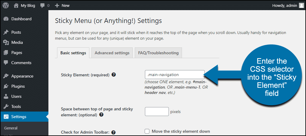
We’re going to use the “Sticky Element” field to set our sticky image. That’s where we enter the CSS selector.
The other options, “Space between top of page and sticky element,” “Check for Admin Toolbar,” “Do not stick element when screen is smaller than,” “Do not stick element when screen is larger than,” should be self-explanatory. We won’t use any of those for this demo.
I’ll enter .main-navigation into the “Sticky Element” field. Be sure to start the selector name with a dot.
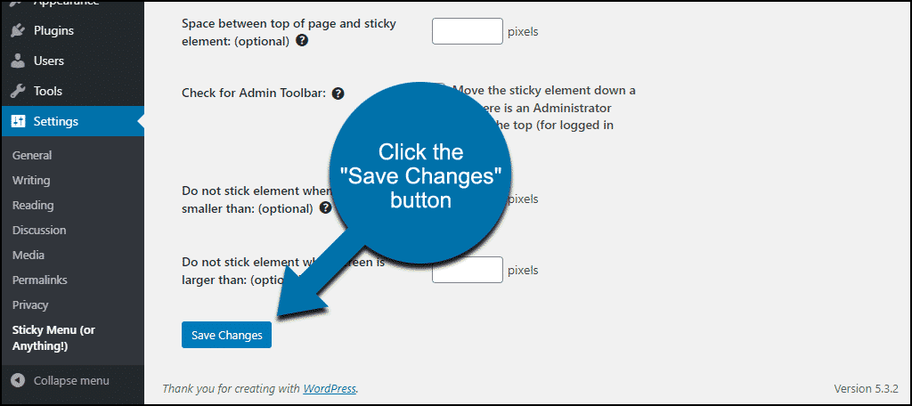
Scroll down and click the “Save Changes” button.
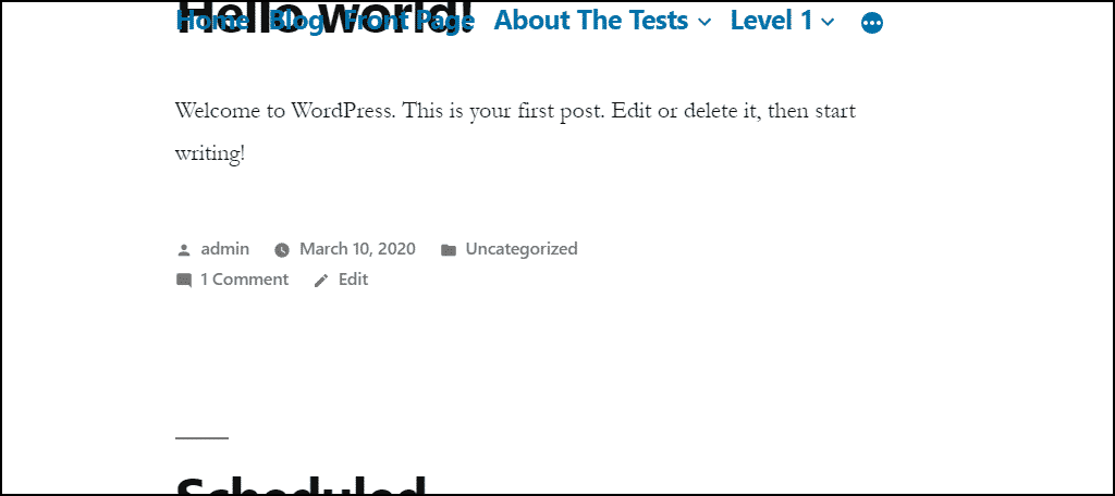
Now we can see if we scroll down a page on the site, the menu remains visible.
But it doesn’t look very good, does it?
Let’s fix that.
Applying a Background Color to a Sticky Menu
Our sticky or floating menu looks a little garbled when there’s other page text under it. The menu is purposely transparent so it will look good if you change the background color in your theme. But for our purposes, it needs a background color.
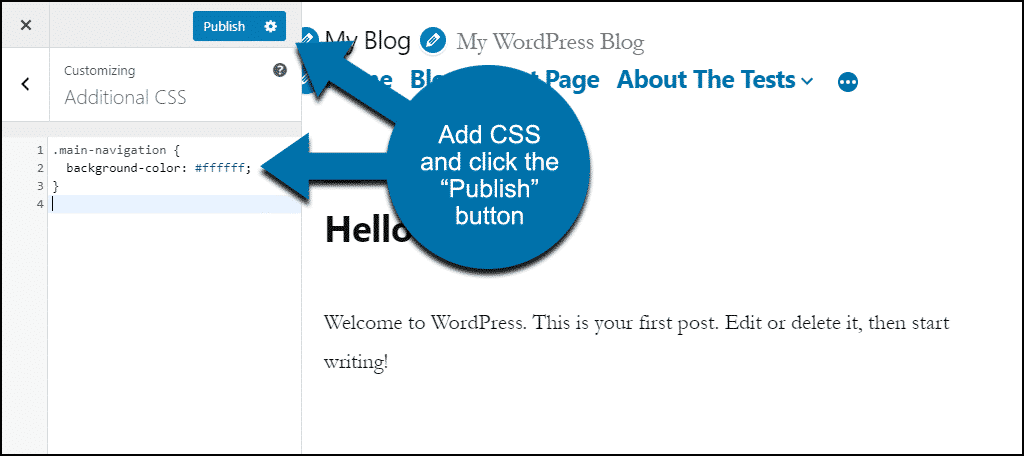
We’re going to do that with “additional CSS.” Where your additional CSS is located depends on your theme. But for many themes, it’s in the “Theme Customizer.”
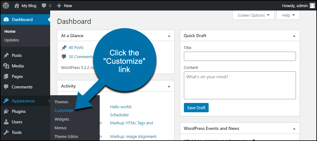
In the left column navigation, mouse over the “Appearance” link and click the “Customize” link.
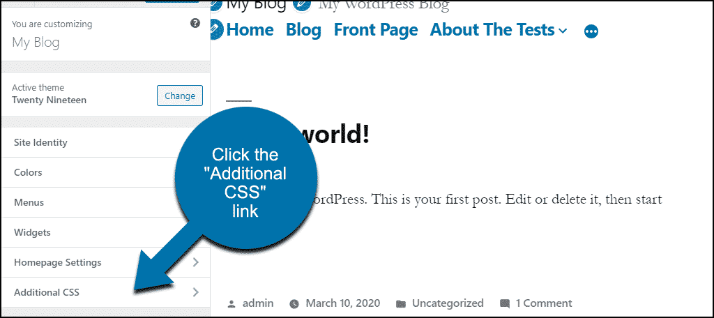
Click to open the “Additional CSS” section.
Define a background color for our class, .main-navigation.
.main-navigation {
  background-color: #ffffff;
}
Enter the background color CSS in the “Additional CSS” field and click the “Publish” button.
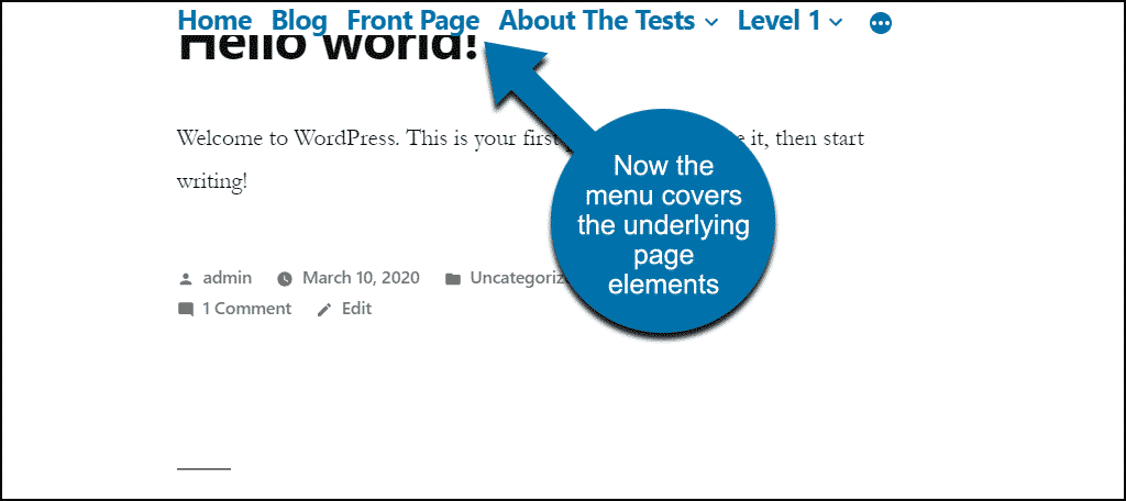
Now if we scroll down a page, we can’t see text under our menu.
Sticking Other Page Elements
The same method we used to stick our menu can be used for any page element that has a CSS selector.
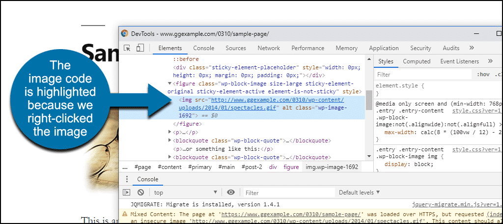
For example, we could stick an image. If we right-click an image, the image tag (
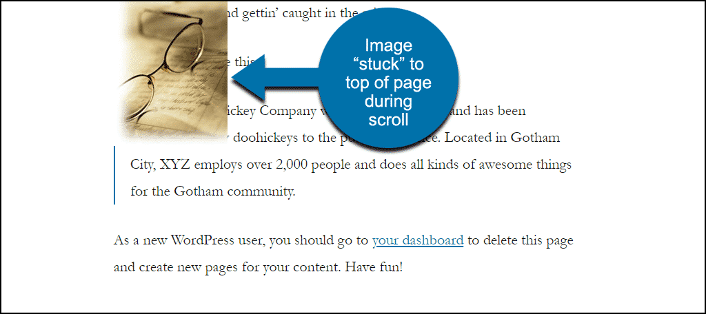
The CSS class for the image is .wp-image-1692, and if we add that to the plugin as we did with the menu selector, when we scroll down the page the image remains visible.
So we’ve used the plugin to make a menu and an image sticky. But you can float or stick shopping cart icons, call to action buttons – any page element that has a CSS selector.
As you may have noticed, the plugin is limited to a single sticky element. The developer says a future version will have the ability to configure multiple sticky elements.
What Happens if You Uninstall the Sticky Menu Plugin
If you uninstall the plugin, elements that used the plugin will be affected. The elements that were configured to be sticky will revert to their default behavior.
Usability Should Always Be Our Priority
A floating menu on your WordPress site is usually a good thing. Having the website choices available to the visitor at all times can be seen as a usability enhancement.
Usually.
If you have a large or otherwise obtrusive menu or navigation, continually floating it in front of the other site content could ultimately become annoying. It could even prevent a visitor from seeing important content.
Similarly, as in our demonstration here, floating a small image probably wouldn’t be the best use for the plugin. But finding the correct image CSS selector was more straightforward than say, finding a top navigation selector. That’s why the image was used as an example.
When we discover website technology that does cool things it’s tempting to over-use or misuse it. It’s important to make usability a priority and strive to make it a positive force on our websites.
Do you remember frames (and does the memory make you cringe just a little bit)? Do you use sticky or floating elements on your website? Let me know in the comments.

