Have you been thinking that it is time to improve the accessibility of your website? Oftentimes, we don’t want to add WordPress accessibility because it affects the site design and beauty. However, not adding accessibility creates a bad user experience for people with disabilities.
This kind of attitude can really alienate a lot of users. For example, did you know that 8% of men are colorblind? If your website is not readable by these people, that’s a lot of potential traffic lost. This is just one of many reasons why you need to add WordPress accessibility to your website.
What Does WordPress Website Accessibility Mean?
WordPress accessibility means that you are trying to create design techniques that make a product more accessible to users with disabilities.
In many cases, this is overlooked. But, it is very important to give users with disabilities better WordPress theme accessibility in order for them to be able to experience your website the correct way.
By making your website more accessible, you decrease the probability of users with disabilities needing assistance to use your website. It can be little things, too. Of course, there are a number of things you can implement in your quest for better WordPress website accessibility, but even the smallest things can have an impact.
You would be surprised as to how big of an effect website colors have. Consider other details that you need to make more accessible.
- Font Resizing
- Keyboard Navigation
- Site Colors
- Highlights
- Cookies
- Links
- Images
All of these and more are things you may want to consider adding to a website to make it more accessible. You could even take this a step further by redoing the design of your site and adding one of many available accessible WordPress themes.
Today, I will show you how to easily add WordPress website accessibility for people with disabilities in an attempt to make it easier for them to view the content. Let’s take a look at the plugin we are going to use today and see what it has to offer.
WP Accessibility Helper (WAH)
WP Accessibility Helper (WAH) is a very simple to use and understand WordPress accessibility plugin. It provides website owners with easy options to configure and gives them a way to make their WordPress website more accessible to those with disadvantages.
When a website is designed properly, then all users have proper access to the information and functionality provided on the site. This WordPress ADA compliance plugin helps site owners solve important accessibility problems like font size, contrast, titles and aria-label tags, and image alt tags.
By taking advantage of the tools and features provided by the plugin, you can easily make your site more accessible when appropriate. Let’s get this tool installed and running together.
Note: There is a pro version with additional options. These include a lot of useful features that you may want to consider, such as a larger mouse cursor. Feel free to browse over them and see if this is something you want on your site. The tutorial below is based on the free version of the plugin.
Make Your WordPress Website More Accessible
Step 1: Install and Activate the Plugin
There is a simple step-by-step process to getting your site to a place where it is more accessible to those with disabilities. The first thing you want to do is to install and activate the plugin.
You can do this by heading over to the Plugins page of the WordPress admin dashboard.
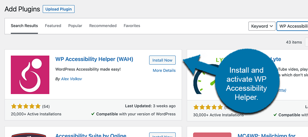
Simply use the available search field on the page and search for the plugin by name. Once you see the right one pop up, install and activate it right from there.
Step 2: Go to the Accessibility Page
Once the plugin has been installed and activated, you need to jump right over to the main “Accessibility” page. You can get there by clicking on the Accessibility tab link that is located on the left side menu area of the dashboard.
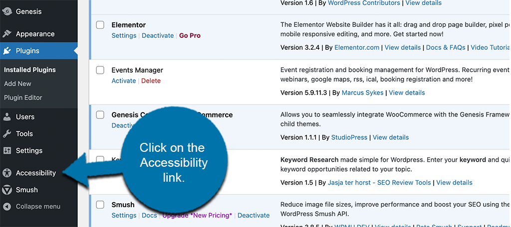
From this main page, you will be able to configure all the WordPress accessibility options needed to make your site more accessible.
Step 3: Configure the Plugin
Here, you will see quite a few settings available. Under each main setting box is a list of relevant configurations you need to make.
You will see options for:
- Global Settings
- Font Settings
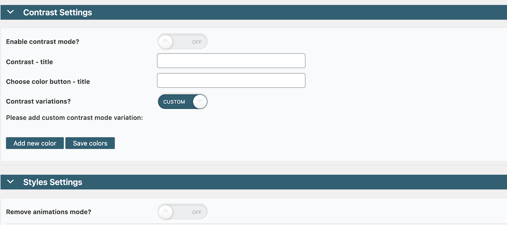
- Contrast Settings
- Style Settings
- Links Settings
- Content Settings
Global Settings
This box is where you will configure all the global settings for the plugin. This includes options like theme style, mobile, images, buttons, and transitions.
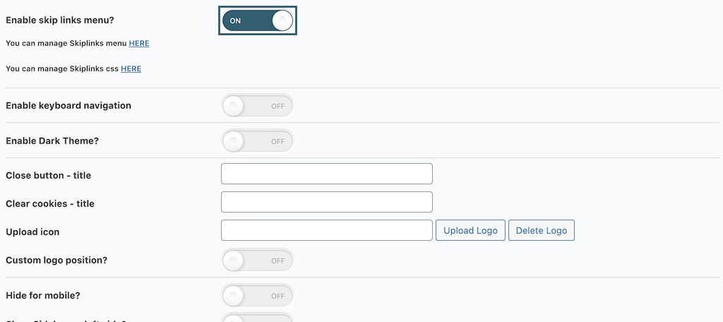
Font Settings
Configure all the font settings for the front end of the site under this box
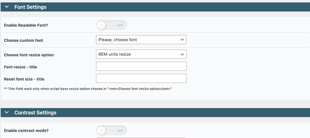
Contrast Settings
Apply more color contrast settings under this tab to make colors more accessible.
Styles and Links Settings
Under these boxes, you will find options to set your styles and links for the plugin. Configure them how you see fit for your site.
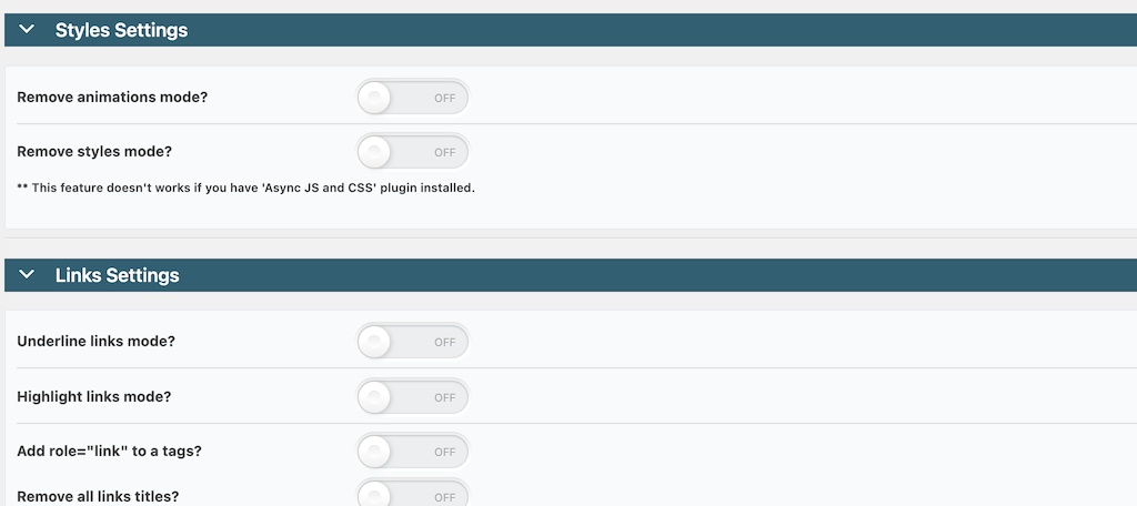
Content Settings
Lastly, set the checkbox for content settings how you want.
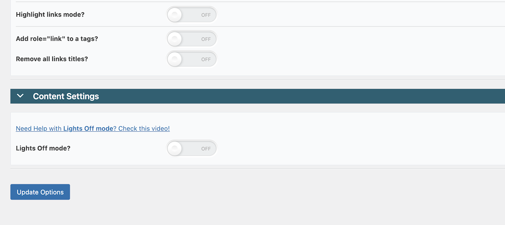
When you are finished, click on the “Update Options” button at the bottom of the page to ensure all your configurations are applied.
Step 4: Order Widgets Appropriately
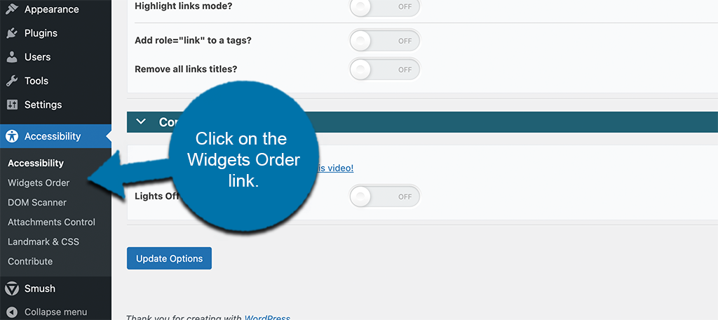
After all the main configurations are done, jump over to the “Widgets Order” page. Simply click on that link on the left side menu area.
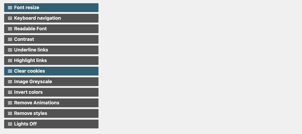
Once on the page, you will see a list of the widgets included in the plugin. You can order them however you want using a drag and drop technique.
Step 5: View the Live Accessibility Pullout Window
Once you get the options and settings configured to your liking and save everything, you are ready to see it in action. Head over to the front end of your website. You will now see that there is a little accessibility icon on the top right or left, according to your configurations
Visitors simply need to click on it to pull out a WordPress theme accessibility menu. It provides options to help them view your site and get around properly.
![]()
A user can now click on that icon and all the WordPress website accessibility options you made available in the settings area are now available for them to use.
![]()
Note: I highly recommend letting your user base know of the existence of this button. It is very easy to miss, and that defeats its purpose. You can see that it is small, so it can get lost in the mix sometimes.
Other Tools Available in the WAH Plugin
The WP Accessibility Helper plugin has a few other tools that you can take advantage of as well. You will notice on the left side menu of the plugin that there are also links for:
- DOM Scanner
- Attachments Control
- Landmark & CSS
Feel free to check these areas out whenever you like and take advantage of them
- DOM Scanner: This allows you to scan (analyze) your web pages for WCAG errors.
- Attachment Control: This allows you to control all the functionality and accessibility of every attachment on your site.
- Landmark & CSS: Control HTML 5 elements selectors and add custom CSS if you know how.
Is WordPress Accessible Out of the Box?
This is a question that a lot of us have. While there are obviously a lot of different things you can do to make your WordPress website more accessible, how much does WordPress actually offer in this aspect right out of the box?
Actually, the answer to this is that WordPress is very accessible by default. As a matter of fact, WordPress has a full team that is solely dedicated to accessibility. The team is dedicated to making the WordPress Admin and bundled themes fully WCAG 2.0 AA compliant where possible. They have a whole page dedicated to this where you can read more about WordPress Accessibility Standards.
The Gutenberg Editor
Since its release in late 2018, the Gutenberg Block editor has been at the center of a lot of arguments and disagreements in the WordPress community. Some developers and site owners loved it from the start, while others have been against it and remain so even now.
All that being said, one thing you can’t deny is that the WordPress Project and its teams have been very dedicated to making the editor accessible to all who need it.
Originally, audit notes found that four major accessibility issues were found. Those were fixed fairly quickly. As auditing continued through 2019 and into 2020, an additional 90 items were found that needed to be fixed.
There have been an additional 116 items that have been closed through the process. Of the original 90 that I spoke about above, only 21 remain open (when this article was published).
You can see that WordPress developers are working diligently to make everything as accessible as they possibly can.
How to Be More ADA Compliant
Unfortunately, making your website more accessible and ADA compliant can sometimes impact its overall design. However, it is completely worth it and I would argue if your website cannot be enjoyed by anyone, it wasn’t very well designed, to begin with.
But, this can be upsetting for many beginners who have their hearts set on a certain layout. For this reason, I strongly suggest identifying the areas of your website that visitors struggle with and collect feedback.
This can serve you to not only help disabled users that access your website, but improve the overall experience. After all, sometimes it really is just bad design.
Select an Accessible WordPress Theme
We touched a little on this above. If you are thinking about overhauling your website and doing a redesign, then why not choose a WordPress theme that is already accessible. WordPress lists their accessible themes so they are not hard to find.
These themes have all been tested for accessibility and they all meet the required standards. If you are searching for paid themes, then make sure to contact the developer to inquire whether or not the theme in question has the accessibility you need.
Consider Color Blind Users
One of the most forgotten-about groups during website design is those who are colorblind. Friendly color blind design can completely alter the appearance of your website because you cannot put colors on top of each other.
In fact, web designers utilize a color card that shows how certain colors will be viewed by both normal and the most common color blindness.
A great tool to utilize is the color blindness tool by Toptal. This tool allows you to enter your website’s URL and apply different color blindness filters. This will help you see what your website looks like in their eyes.
However, it isn’t just the main design of your website that may be the problem. Instead, the smaller icons are normally the biggest issue.
For example, if you rely on displaying a green dot when something is good and a red dot when something is bad, some cannot tell the difference.
To fix this, you should add symbols as well as colors. In this case, you should add a checkmark in green and an X in red. This ensures that even if the visitor is colorblind, they can see the difference as most will recognize these universal symbols.
Collecting feedback from users will really help you identify problem areas on your website. So make sure to do so.
Final Thoughts
WordPress website accessibility is important for everyone because you want visitors to be able to enjoy your site the way they need to. However, it is very challenging to make a website accessible to everyone without compromising your design.
For this reason, you do need to spend time and research common problems people have with certain disabilities.
What do they encounter when trying to view websites? In many cases, the smallest changes are all that you may need.
And in most cases, it makes it easier for everyone.
Since reading this, have you used this WordPress website accessibility plugin? Did you already have accessibility in place using a different technique?

