Are you looking for a simple way to add a visual chart into WordPress? Charts are a great way to display information in a compact, but easy to understand format. However, WordPress only allows you to make a simple table consisting of rows and columns.
While this can be extremely useful, it is very limited. Luckily, there are plugins that can add more options like an inquiry chart (ichart), pie, bar, line, and many more types of charts and graphs. This opens a lot of new avenues for displaying information within WordPress.
Today, I will demonstrate how to use the iChart – Easy Charts and Graphs plugin to create a variety of charts in WordPress.
Why Add A Visual Chart in WordPress?
Adding a visual chart in WordPress has multiple advantages.
For starters, it is a really effective way of displaying information. Graphs are very unique and the way they are displayed is very different. For example, take a pie chart and a traditional table. You can display the same information, but the pie chart is objectively easier to understand.
This is because it is color-coded and doesn’t have much to read apart from the name of the pie slice and percentage. Thus, it is a better way to display information to an audience.
And keep in mind that most people are “visual” by nature. Which means they are more likely to remember information when tied to an image of some kind.
The second main advantage is that it makes your website seem more professional. How your website appears is critical for success. And this is even more true when it comes to the tone for your website.
For example, imagine a lawyer’s website.
You would absolutely expect your lawyer to be professional, but if you ran into a website that was comical in tone, you probably wouldn’t hire them.
For these reasons and many more, using WordPress charts are a valuable addition to most websites.
Installing iChart
iChart is a WordPress chart plugin that allows you to create a wide variety of visual charts for your website. This plugin allows you to build pie, bar, line, polar area, radar, and doughnut charts. This gives your website a great selection of options when it comes to displaying information and data to visitors.
And unlike many of the other WordPress graph plugins available, this one is actually easy to use. So let’s get right into it!
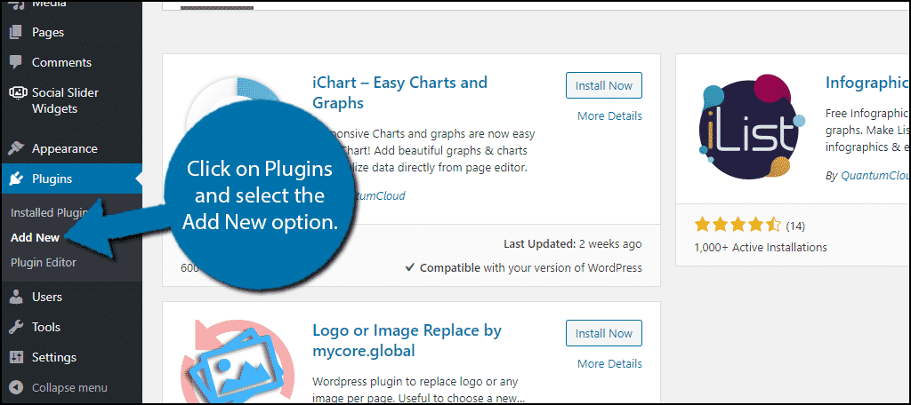
To start, click on Plugins and select the Add New option on the left-hand admin panel.
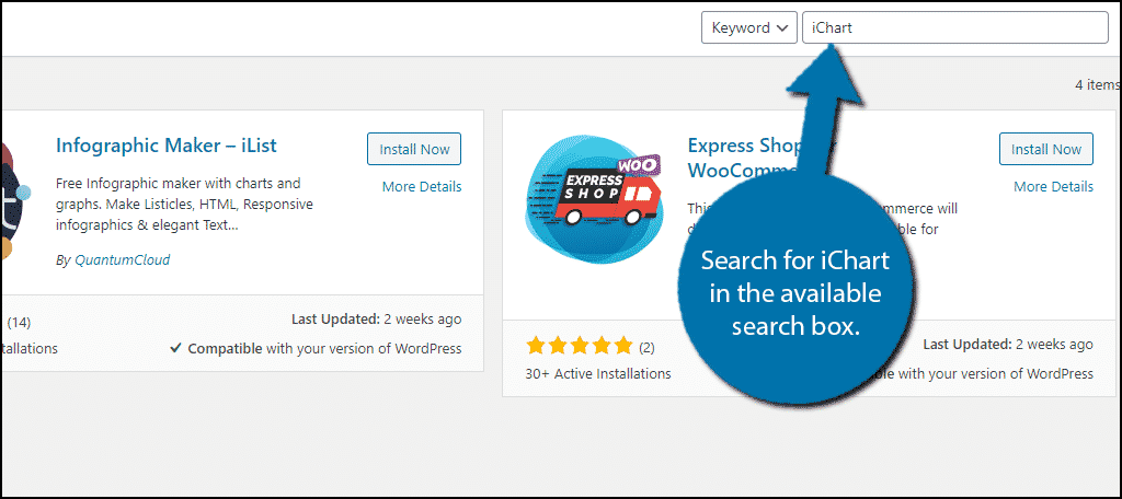
Search for iChart in the available search box. This will pull up additional plugins that you may find helpful.
Scroll down until you find the iChart plugin, click on the “Install Now” button and activate it for use.

Built-In Tutorial
Creating Charts with this plugin is really simple and that is because it provides a full list of steps on its help page.
On the left-hand admin panel click on the iChart option.
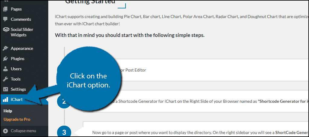
Here you can find all of the steps you will have to take to add a chart. This is a great resource to use if you are confused. It highlights how to utilize the plugin for both classic and Gutenberg editors.
Creating Charts in WordPress
Now to actually begin, go to any existing page or post or you can create a new one. Once you are on the page or post, click on the “+” button.

Search for iChart in the available search box. Click on the Quick iChart block.
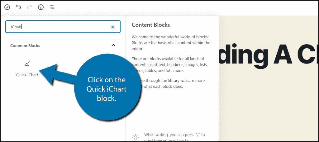
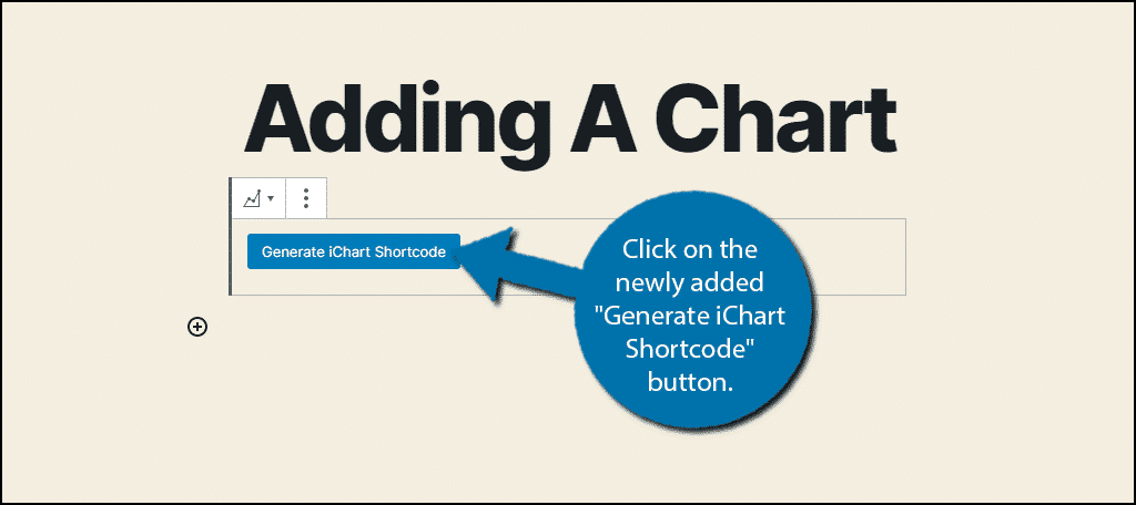
This will actually add a button to that page or post. Click on the newly added “Generate iChart Shortcode” button.
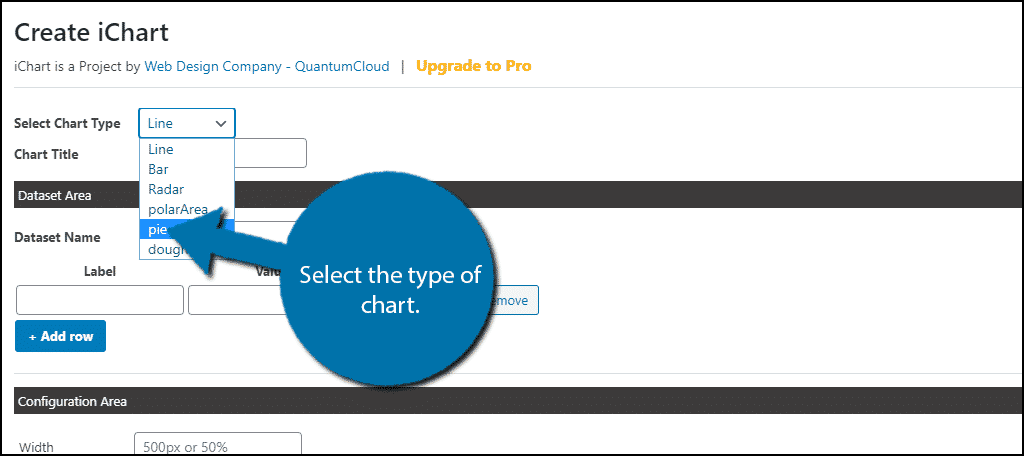
This will open the settings for the chart you are about to make. The first thing you need to do is select which type of chart you want to create. For this tutorial, I will focus on a pie chart.
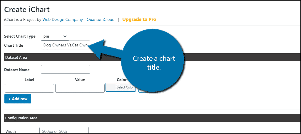
Underneath this, you can add a title for the chart. It is always recommended to name any visual chart you add. This helps the reader understand what they are looking at.
The next section is the Dataset Area. Here you will be entering the actual data for your graph. This information must be inputted manually, which can be quite tedious when there is a lot of data. However, you simply need to fill in the label (what this data is) and the value.
If you need more fields, simply click on the “+Add Row” button. You can also assign the color the data will appear as.
In my case, I am making a pie chart for pet owners. So, I used three rows. One for dog owners, cat owners, and “Other.” However, it does not matter which chart type you choose, the data input section will not change.
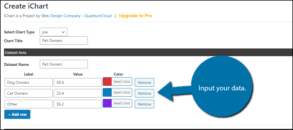
Note: You should not add the “%” symbol. In my example, I have Dog Owners at a value of 38.4. If I used 38.4%, the pie chart would not work. Generally, if something does not appear right, it has to do with how you entered the information.
The last few options are cosmetic, so pick the ones that best suite your website. When you are satisfied, click on the “Generate Chart” button.
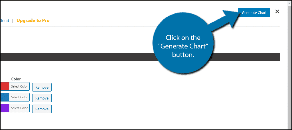
Upon doing so, the plugin will generate a shortcode for you. Click on the “Copy & Close” button.
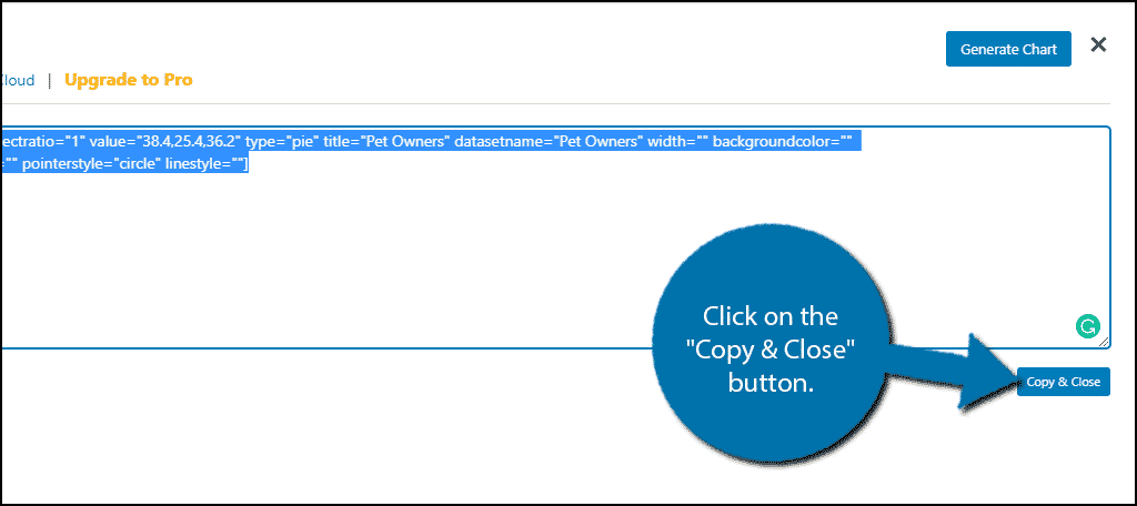
Note: This shortcode can be added anywhere on your website. This includes posts, pages, and even text widgets. However, if you choose to add this to a sidebar, make sure it is sized properly.
Doing so will add the shortcode to that post or page. Now you can either click the “Preview” or “Update” button to see your new visual chart.
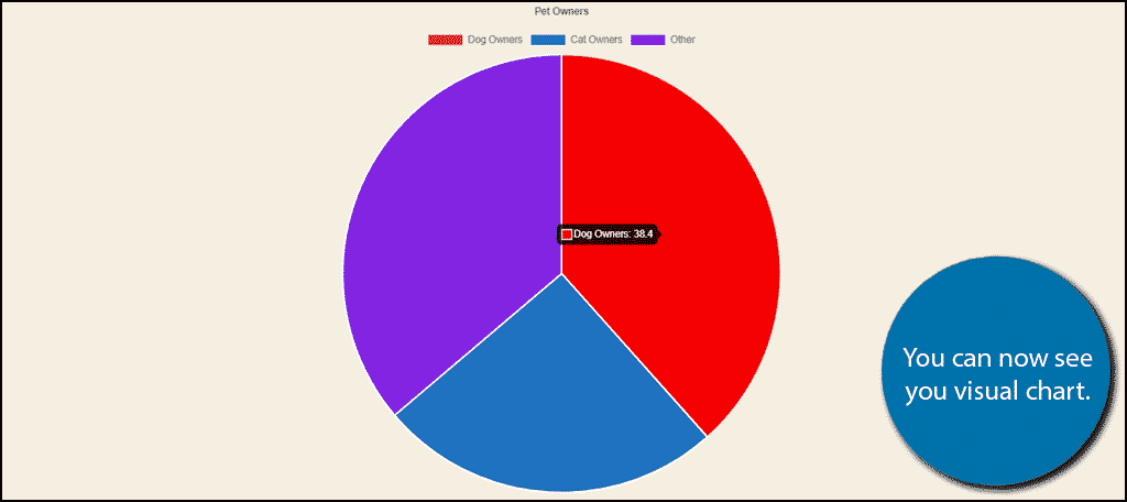
If you need to edit the chart, simply click on the “Generate iChart Shortcode” button again. It will have everything you entered saved. However, if you delete the shortcode completely, you will need to enter all of the information again.
Congratulations on adding a visual chart to your WordPress website.
Fact Check Your Information
Charts and graphs are excellent ways to display information, but one thing they have no control over is the actual data itself. Creating professional-looking charts with incorrect information could severely ruin your reputation as a business.
Thus, you need to make sure the information you are using is correct. For this reason, I strongly recommend citing any sources when applicable. This provides visitors a way to see where the information is coming from and judge how reliable it is from the source.
Which of course means it is important to make sure a source is credible before you cite it.
The more respectable your sources are, the less you will run into misinformation. And more importantly, visitors will think you are more credible if you use credible sources.
Don’t Go Overboard
Visual charts are really great and can be a huge asset to the content they appear in. However, sometimes it just isn’t necessary. In reality, they should be used when you have multiple comparisons to make. If you are just listing a single fact, you don’t need a 1-section bar graph.
You also don’t need to show the same information in a different type of chart. You should only need one chart of the information to help visitors absorb the data.
Do you think WordPress should have more built-in chart and graph options? What types of charts will you be more likely to use?
