Your online appearance is just as vital to success as your real-life interactions. Think of little virtual people coming to visit the digital representation of your business. Would they feel invited or be repulsed by what they see online?
The overall look of your site will play a dominant role in whether someone decides to continue reading or move on. In fact, the most simple design changes can and will affect the success of your website.
Here are seven of the worst website design ideas for business you shouldn’t consider.
1. Overloading the Homepage

Some website owners will try to cram every bit of information possible into the homepage. Not only does this look horrible to the new visitor, but it can have an overwhelming appearance.
In reality, a very large portion of your visitors may not even see your homepage. The majority of traffic for many sites comes from quality content through search engines and social links.
These often lead directly to pages within the site itself, which bypasses the homepage altogether.
The homepage should be viewed as kind of a welcome mat. For those visiting your site for the first time, they need to feel at ease. Too much activity with the first screen often takes away from the content.
Try to keep the bells and whistles to a minimum. Many have found a minimalist approach to design to be a better answer than trying to cram too much on the homepage. These kinds of designs are often faster, which also boosts search engine optimization thanks to website speed.
2. Choosing the Wrong Typography

A lot of owners don’t consider just how influential the right typography can be for a website. Yes, choosing the right fonts and colors of your text can play an important role when keeping visitors engaged.
For instance, using a red font over a multicolored background can be very distracting. Another practice that many use on the Internet is using colors so faint that they are difficult to read.
The text of your site needs to be indistinguishable from the rest of the format. In many cases, experts attest to using corresponding font colors over plain, single-color backgrounds.
This makes the text more obvious to see and easy to read. While a font can offer a sense of typographic statement, as mentioned by Fonts.com, your target audience still needs to be able to make out the words.
3. Poor Image Quality

Images can play a very important part in keeping the attention of your visitors. High quality, color images relevant to the text increase the ability to retain readers. However, use of imagery should be limited.
Each graphic on your site takes time to download and render. This could be too much of a good thing, especially since visitors can become frustrated and leave your site.
For most images, you don’t want to go over 100kb in file size. Sometimes this means altering the resolution and the quality of the image before you upload it. Larger image files take longer to load and will reduce your result ranking in search engines.
4. Gaudy Background Colors

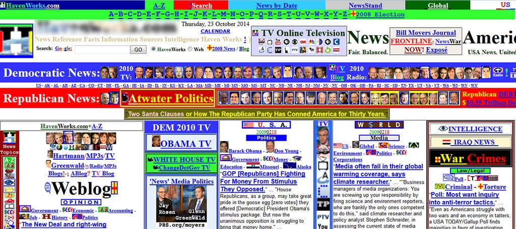
One of the worst website design ideas for business is using a menagerie of gaudy colors in the background. Too often, developers will get a bit over-zealous with adding too many contrasting elements in a small area.
These bright colors can obstruct view to the text and be quite unattractive to those visiting the site.
For today’s Internet user, you want to keep the background simple and easy to absorb. You don’t want to bombard your visitor with a wide array of color or something that is overly bright.
You want to pick a pallet that isn’t going to be viewed as an irritant. Certain colors can affect humans in a specific way, and the last thing you want to do is give someone a headache as they try to read your site.
5. Too Much Randomness

For those who don’t have a design strategy in play for their website, it may be easy to get sucked into placing random images and links. A site can begin to look very cluttered if there isn’t a resemblance of order.
Tables that are unevenly spaced, a collage of images of variable sizes and linking nearly every bit of text can easily make a site look cluttered and difficult to browse.
An overabundance of random links and imagery can easily spoil a business website. You don’t need to fit everything possible into one post or page. Here are a few ways to avoid that sensation of randomness:
- Categorize Content: Keep like-minded pieces together and easy to find.
- Justification: If you insist on using tables or widgets, make sure they all flow evenly throughout the site.
- Include Navigation Menus: Never underestimate the value of a well-designed navigation menu.
6. Webpages that are Too Busy

There is such a thing as a webpage that is too busy. You may have seen something like this before on the Internet. Flashing banners, animated GIFs, larger-than-necessary fonts and more can make a site difficult to read or understand.
When there are too many things going on in a single view, it pulls the eyes away from any meaningful content.
According to studies by Google, users often judge complex websites as less attractive. Most of these people can determine if the site is appealing in less than a second.
This means the overall appearance of your site can impact a user before he or she even looks at the content.
7. Lack of Proper Responsive Design

Today, responsive design is virtually a requirement if you want to build a successful website. However, a lot of owners don’t put thought into the proper methods for developing a mobile-friendly layout.
For example, optimization is often overlooked regarding everything from images to the layout of the site on smaller displays. This can greatly affect the overall performance of the site.
Perhaps a 728-pixel-wide banner looks great on a desktop, but it may not work on a smartphone.
More than 30 percent of product searches on the Internet are done through mobile devices, and it’s imperative that your website be optimized for this technology. Here are a few things you should look at:
- How the site looks on your smartphone. Would you use it?
- Optimizing graphics for smaller resolutions. Does it take long to load?
- Logical button and link placement. Is it difficult to find content?
Design for the Visitor
Proper website design ideas for business should focus on overall functionality for the common user. Think of it this way, each visitor that leaves your site is one that your competition may get.
Whether you want to center your ideas around a minimalist design or add greater functionality, you want your visitors to have an excellent experience. After all, it may play a role in whether or not you make a sale.

Absolutely true. I concur with this informative article. Sometimes the designers want the website to look unique. They do forget that website colors, backgrounds variations and other features are meaningless without engaging content. I hope somebody finds this article interesting as I do.
Thank you.
i need help in creating a website
Making a website is easier to do these days with tools such as WordPress. Take a look at our guide on how to make a website.