WordPress 5.0 is upon us and it brings the Gutenberg editor to replace the old content editing system. But, will it be a welcome update? That all depends on how you view the editor and its block-style content management.
And so far, the reviews spanning across the Internet have been less than favorable. In fact, the Gutenberg plugin itself scores relatively low with the general user-base.
What is Gutenberg?
The Gutenberg WordPress editor is a system that replaces the tried-and-true TinyMCE users have grown to know inside and out. Instead of the traditional word processor-like appearance, Gutenberg replaces the field with “block” editors.
Each section of content is held within its own block, which is supposed to make it easier to modify specific elements of content.
This editing method essentially forces users to create content using a visual-only editor. For example, you no longer have access to the Text editor from TinyMCE. However, Gutenberg does come with a way to directly edit HTML.
The idea is to create an easy-to-use interface for beginners, much like you’d see on website building platforms.
How Does the Gutenberg Editor for WordPress Work?
The editing system replaces the TinyMCE editor with a field consisting of “blocks.” Each portion of content will use these blocks to govern over its content.
For example, the title, headers and actual content of a post are all segmented within these blocks.
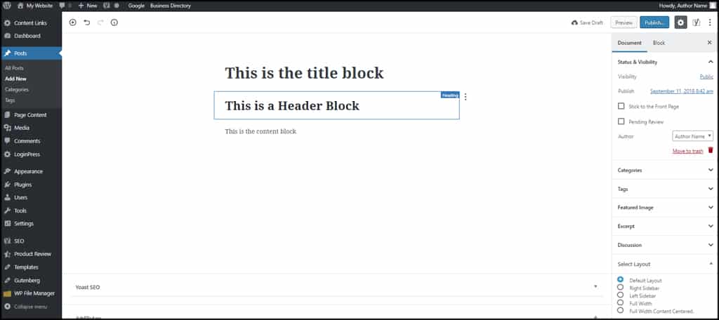
In the right column, you’ll still have access to various tools such as choosing a category, tags and the featured image. You’ll also have the option to make adjustments to a specific block.
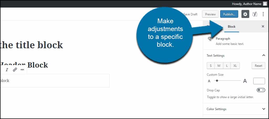
Unfortunately, the block editing system is void of the tools you’d find in plugins like TinyMCE Advanced.
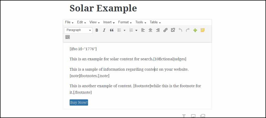
You can choose to use the “Classic Editor” for WordPress in your content blocks, though. This way, you’ll still have all the tools from the TinyMCE editor in the top tool bar.
What are Some of the Benefits to Gutenberg?
Although the majority of reviews are not encouraging for Gutenberg, the WordPress editor does have a few benefits. This is especially true for new users who are more engaged by a visual creator.
Visual Interface to Build Content
The use of blocks is more attuned to a visual interface than the previous editing system. It’s easy to move paragraphs, affiliate banners, advertisements and more in the interface.
For example, what if you want to move an ad banner to a better position on the post? Using Gutenberg, you can click the arrows to move only the ad portion anywhere you like.
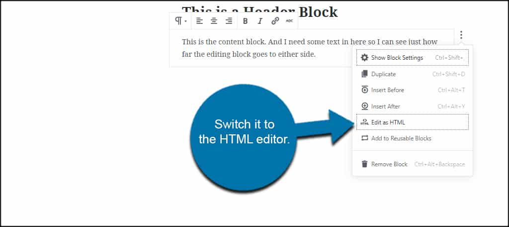
Overall, it’s an easier interface for those who don’t have any knowledge of HTML or how coding for a website actually works. And for those who are keen on HTML, you can just switch it to the HTML editor by clicking a button.
Lots of Embeds Available
Those who like to include external content on their sites might relish in the idea of Gutenberg supporting a ton of embedding blocks.
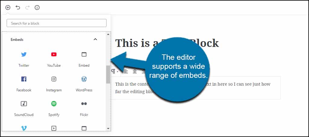
For instance, you can click a YouTube embed in Gutenberg, add the URL and have the ability to move it anywhere you wish on the post or page. The editor supports a wide range of embeds from CollegeHumor to WordPress.tv.
In some situations, this may mean you won’t have to install a plugin for certain pieces of content. It also makes it easier to move things around the site. For instance, you can quickly shift a YouTube video from the top to the bottom of the page.
Plugins to Boost Block Ability
As Gutenberg has technically been around for quite some time, there are already quite a few plugins for the editor. From ultimate collections of blocks to including a map feature, you can easily expand what the editing system can provide.
For instance, you can add the “WooCommerce Gutenberg Products Block” plugin to still sell your goods from WordPress.
And considering how WordPress is forcing users into Gutenberg by default, I suspect more developers will create blocks to make editing more efficient.
Ideal for Mobile Writing
The layout of Gutenberg seems more efficient for those who use mobile devices for editing WordPress. Although the mobile-friendly interface for WordPress is easy enough to use, I can see how this new layout may offer appeal.
The buttons, sliders, options and controls are all perfect for the mobile environment. It’s easy to slide, swipe, tap and activate different elements of the editor from a smartphone.
But in reality, when is the last time you wrote a complete 2,000 word blog post using nothing more than your thumbs to type? I’m not really sure how much of this will be ideal for users, but at least the option is there.
What are the Biggest Complaints About Gutenberg?
From what I can find online, the majority of people using Gutenberg are not happy with the plugin. And it’s not necessarily because they fear change. In reality, a lot of users have legitimate concerns about the new editor.
Format Settings are Scattered
For many, figuring out where the tools are in Gutenberg is like playing hide and seek with the editing system. In the past, your tools were laid out in plain site. The top toolbar of the editor is where everything you need rests.
In the Gutenberg editor for WordPress, the tools are scattered around the layout. Bold and italics are controlled within the block itself while sizes and colors are found in the right sidebar.
Luckily, you can avoid time-wasting processes like this by using the classic editor in Gutenberg. Still, you’d think the developers would center around streamlining content development.
Editing Screen is Too Small
One of the biggest complaints registered in WordPress.org regarding this tool is the size of the editing screen. The blocks are incredibly small compared to the original editor. As a result, there is a vast amount of unused space when creating content.
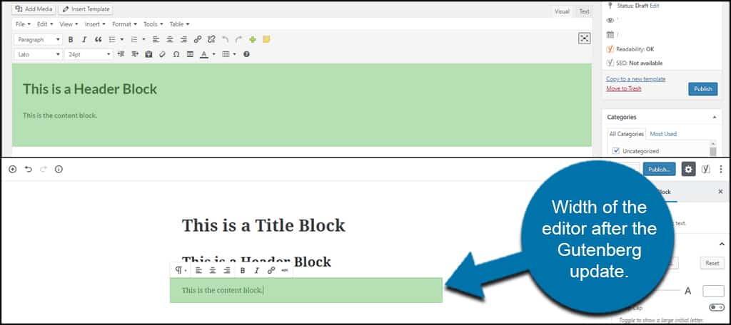
For a lot of people, this may not pose much of a problem. However, it does make certain aspects a bit more difficult to determine. For instance, image alignment and size within text can pose a problem for some in the Gutenberg editor.
Many Plugins are Disabled or Hidden
A lot of plugins will feel the sting of the new content system. For instance, Yoast SEO will no longer show the quality of your content as you type in the right sidebar. After Gutenberg, you need to click the Yoast icon to see its stats.
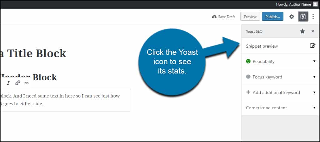
Luckily, some developers have already put in a bit of effort to force compatibility with the new editor. However as with Yoast, a lot of tools will now require taking additional steps while creating content.
In TinyMCE, Yoast shows you the content score on the right in real-time. In Gutenberg, you’ll need to switch back and forth between the block settings and Yoast as you work.
In this regard, Gutenberg is simply slower to use if you’re using certain tools.
Do You Have to Use the Gutenberg WordPress Editor?
Not everyone is going to appreciate the new editing system. In fact, the majority of the ratings for the Gutenberg plugin are negative. In light of the massive changes to the system, do you have to use the Gutenberg editor for WordPress?
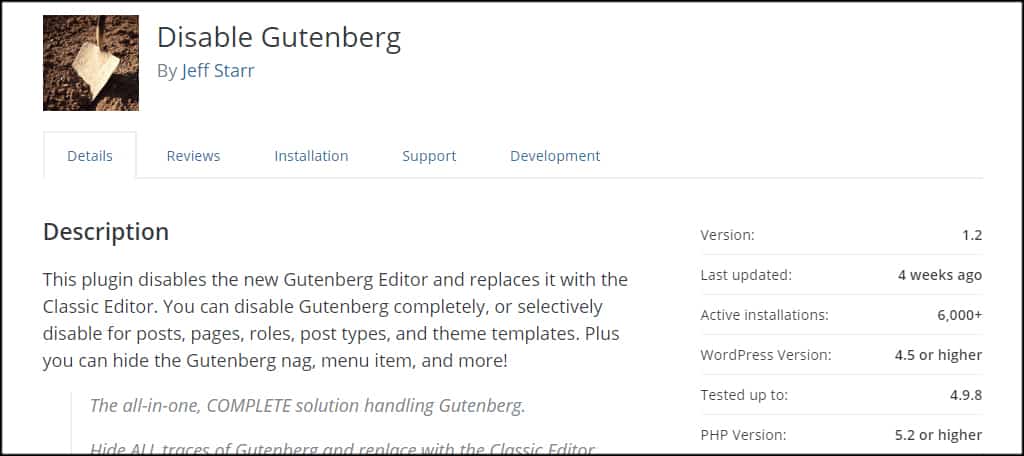
No. In fact, you can install and activate the “Disable Gutenberg” plugin and set it to turn off the editing system throughout your entire website. Or, you can simply shut down the editor for certain aspects like posts or pages.
Where Can You Find More Info on Gutenberg Development?
You can access the development by visiting the Gutenberg Github page. It has a branch of the entire process, releases and an overview of contributors.
Github also provides the ability to list new issues you’ve found with the editing system. Just make sure you scan through the several thousand issues before listing your own. Someone may have already informed the team.
When Can We Expect a WordPress 5.0 Release Date?
Currently, I am unable to find a release date for WordPress 5.0. However, I am sure that it’s in the very near future. Until then, users can install the Gutenberg plugin and try it for themselves.
This will give WordPress users an idea of what to expect when WordPress 5.0 becomes live.
What is the Reality of Gutenberg in a Standard WordPress Post?
So, each area of content is held in specific blocks. In reality, this post would need 35 blocks in total if I used Gutenberg to write it…and that’s if I add the images to the content blocks without using their own.
And what about using the Proofreading feature of Jetpack? I use this an awful lot, which is disabled in the Gutenberg blocks.
Overall, it takes longer to create a post in Gutenberg than if I use TinyMCE Advanced.
Of course I could combine everything into a single block and edit the headers in HTML. But at that rate, I might as well install the “Disable Gutenberg” plugin and be done with it.
Will Users Embrace Change?
In the end, many attribute the WordPress Gutenberg project at an attempt to become more like a page builder like Elementor or SiteOrigin. But will the cost of simplicity be that of functionality?
That all depends on whether Gutenberg is embraced by the majority and if plugin developers make adjustments accordingly.
I remember a time when the Jetpack plugin was included in most installations of WordPress by default. With the amount of negative press Gutenberg has accumulated, it may be something developers leave out in WordPress 6.0.
In either case, it’s hard to determine if Gutenberg is going to be a success story or one of the worst failures of WordPress. In the end, it’s all about personal preference and popularity.
