WordPress 5.9 is finally here and it dramatically increases the customization options with the platform. Perhaps the biggest feature is sitewide customization that requires zero coding, on top of a host of other features.
Let’s get right into what this update brings to the table.
The Site Editor Is Here (Beta)
Last year, 5.8 introduced this feature to us all, and it was glorious. Now, it’s being expanded even further in WordPress 5.9. This will help improve accessibility within the platform, making it an even more amazing low-code environment.
Note: Many of the features listed here are only available within the beta, and the beta is only available in a full-block theme. A great option is the new Twenty Twenty-Two theme. Upon its activation, you will see the new Editor option under Appearance. More on this later.
Site-Wide Blocks
First and foremost, site-wide blocks are here! In total, there are 10 new blocks that you can find under the Theme category.
These site-wide blocks include:
- Navigation
- Template Part
- Header
- Footer
- Post Author
- Next Post
- Previous Post
- Post Comments
- Term Description
- Archive Title
While all of these are exciting, I really want to talk about the Navigation block because it is a game-changer. It allows you to easily build navigation menus. You can customize every element including the size, alignment, spacing, colors, and much more.
Unfortunately, this feature didn’t make it into the actual release window, but it is available within the current beta. If you currently use a plugin dedicated to navigation menus, you may no longer need one when it goes live.
Sitewide Styles
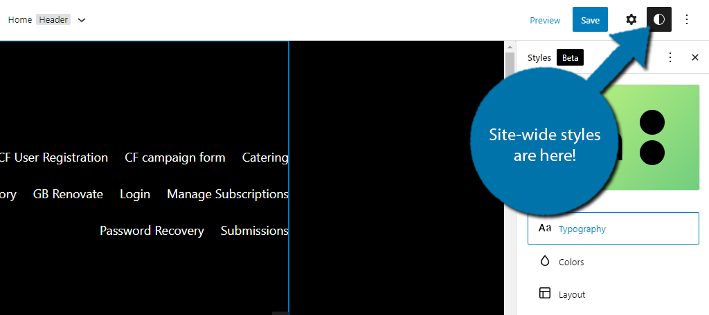
In the past, making sure your entire website gave off the same vibe required editing every page of your website individually to have the same aesthetics, but not anymore.
Sitewide styles are here and they are changing the landscape.
Essentially, you can change the style of a page (color, typography, etc.) and save them site-wide. This, in turn, makes those changes to every page, and trust me, while this may sound simple, this can save site owners hours of customization.
No more individual page editing (unless that’s what you want). Instead, customizing your site has never been easier.
Block Styles
Similar to site-wide styles, you can customize blocks to be pre-configured the way you want them to. Not all blocks support this feature, but the list of supported blocks will certainly grow in upcoming releases.
A great example of this would be the Buttons Block. It’s a simple block that most should have used at some point. But you might recall having to get the color scheme right every time you add a new button.
Well, not anymore.
Now the block can just be set to the colors you always use. Thus once again, saving time. They really should have called this the time-saver update.
The Block Editor Has Been Updated
Fear not, there were plenty of goodies added to Gutenberg. And unlike the site editor, these are actually available within the WordPress 5.9 update and ready for use regardless of what theme you use.
So, let’s get into it.
List View
The List View has been updated to include a drag-and-drop functionality. In the past, this mode simply allowed you to view a list of blocks and gain quick access to them, but now you can rearrange them entirely.
To access it, click on the three lines in the top left.
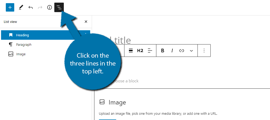
List View will display all of the blocks on the post or page. You can use the three dots on the right of the block to select the typical block commands (copy, duplicate, delete, etc.). You can also click on the block to be brought to it immediately.
This is particularly handy on very long posts where it may take a while to scroll down.
The key change here is that the blocks in the list view are now movable. All you need to do is click on the block and drag it to the desired position.
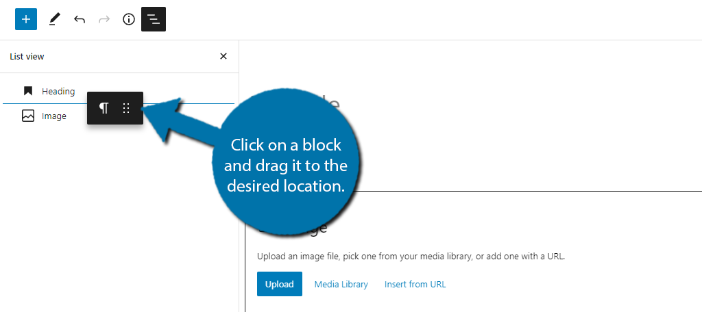
In the past, the only way to move blocks around was to select them and use the move up or down command. Alternatively, you could also copy and paste them. In either case, it left a lot to be desired.
Again, another excellent time-saving tool.
Navigation Block
I briefly talked about this already, but that was in regards to site-wide changes. This block is available within the Gutenberg editor and it has a very interesting feature that most won’t know about without experimentation.
It allows you to create a table of contents. Yup, you don’t need a dedicated plugin anymore!
To do this, you just need to create a jump link and place it in the Navigation block and you can create a usable table of contents. That said, the functionality is still somewhat limited and not that user-friendly.
Hopefully, they can update the block to make this easier or create a dedicated Table of Contents block.
Various Justify Settings Were Added
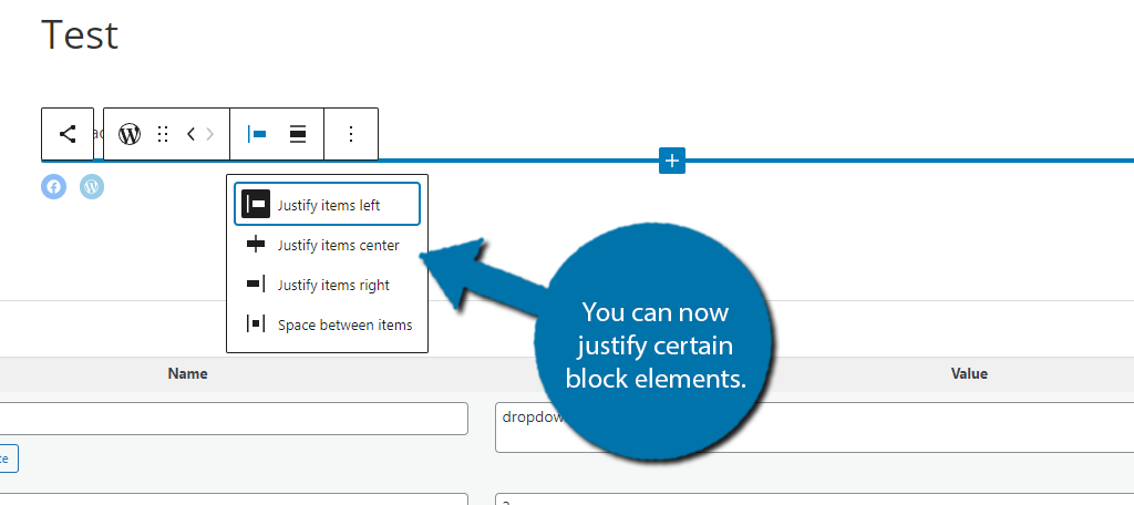
Multiple blocks have been updated to support new Justify options. You now have more control if items are shifted to the left or right, and even the spacing between each option. A great example is the social links block.
Previously, you could only align the block. But now, you can select from the Justify options.
More Options For Headings
As you might have noticed this update has a lot of verticalities, and the Heading block is no different. Instead of selecting the heading from a horizontal menu, it is now a vertical one.
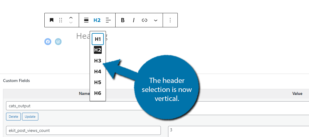
There are also new options available in the block menu. You can now change typography options like size, appearance, letter case, and more. Letter case is particularly useful if you always capitalized all of the words.
It’s a great addition.
Rich Snippet Previews For Links
Linking is an integral part of any website, and this update makes it better, at least from a graphical standpoint. Now, when you click on a link in the editor, you will see a rich snippet preview like so:
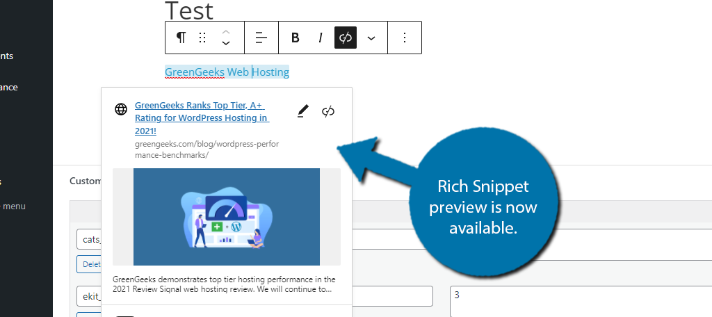
This might not seem that useful, but it is a good way to ensure that the featured image is working on internal pages. However, this is only the first change to the linking system in WordPress.
Improved Inline Linking
There’s a good chance you already use a tool like Link Whisper to help you find internal posts to link within other posts. However, that may no longer be necessary as WordPress now allows you to search for posts via the link option.
Simply highlight the text and click on the link button like normal. Instead of having to paste the URL, you can now search your entire content library with a keyword. No more opening up a new tab to find the link!
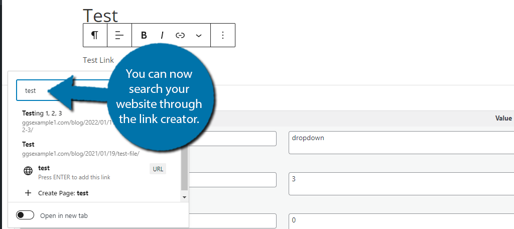
For example, let’s say you want to create an internal link for “SEO Tips.” Once you create the link you can type SEO Tips into the box, it will pull up relevant articles on your website.
It’s a massive timesaver.
Other Various Updates
If I tried to list every single change the update brought to Gutenberg, we would be here for quite a while. Instead, check out your favorite blocks to see what’s new.
But like most of what you have already seen, the updates offer extra customization and viewing options.
The Twenty Twenty-Two Theme Has Arrived
Similar to previous years, WordPress has released a new default theme for WordPress: Twenty Twenty-Two. This theme was built for all of the new features that come with WordPress 5.9 and its future updates.
Note: Changing your theme can have serious implications on a live website. Do not switch themes on a live site unless you have thoroughly tested it.
The theme is installed automatically as part of the update, and all you need to do is activate it. Once it’s activated, take a look at the appearance options. They have all been replaced by the new Editor option.
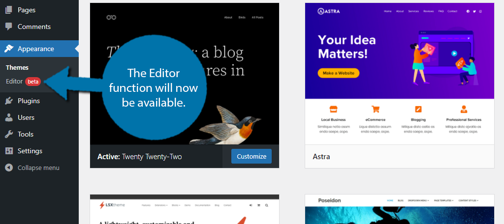
Note: Until it is rolled out in future updates, only select themes will have access to this feature.
The Editor is how you will carry out all of the site-wide changes we covered at the start.
In the past, these actions would need to be done individually by either going to each post or page manually or using the theme’s customizer option.
You should immediately notice that the customizer option, along with everything else, is removed. This theme forces you to use the new tools, but that’s a good thing because they are worth using.
Overall, the theme is an upgrade over the last version and offers users a ton of new customization alternatives.
Changes To Themes
It’s worth mentioning that there are now four types of themes in WordPress.
- Block Themes: These were introduced with WordPress 5.9 and Twenty Twenty-Two is an example of one. They are designed to only use the new Full Site Editor (FSE) and do not support the Theme customizer.
- Universal Themes: These are themes that have been updated to support both the FSE and Theme Customizer.
- Hybrid Themes: These are themes that have been updated to only support the FSE.
- Classic Themes: Traditional themes that use a PHP template and only support the customizer.
The introduction of WordPress 5.9 is going to change the landscape of themes. I am confident that most new themes in the coming months will be block themes. Older themes will slowly be updated to add support for the FSE.
Similar to how Gutenberg replaced the Classic Editor, Block Themes will replace Classic themes. And they offer significant performance improvements, which we will get into next.
Note: It will still be possible to access the Customizer with a plugin.
Perfromance Improvements
As you might expect, there are also a variety of performance enhancements that have gone live in this update. If properly utilized, you can significantly speed up your website.
Here are some of those highlights:
Block Themes Load Less CSS
While this may belong in the last section, it’s worth pointing out that Block themes have significant performance enhancements over traditional themes. This is all thanks to the theme.json settings.
Without getting too technical, this essentially prevents themes from using massive stylesheets loaded with CSS. Or in other words, themes are going to load a lot less data. As a result, you will see significant reductions in loading times.
This is just another reason why Block Themes are the future of WordPress.
Lazy Loading Improved
While Lazy Loading was introduced in WordPress 5.5, to say it got off to a rocky start is a bit of an understatement. Luckily, WordPress has been improving the feature through various upgrades, and in 5.9, it’s gotten much better.
For those familiar with the feature, you just need to add the loading=”lazy” attribute to the image or iframe, but this hasn’t worked great in the past.
The new update will work the same way, but to get the benefits of the feature, you just need to not include it on the very first image on a post or page. Doing so can see pages load 30% faster!
Various Other Improvments
There are a ton of other smaller improvements and addition in this update. Like the new attribute Lock Block, which prevents blocks from being moved or deleted by other users.
There’s something for everyone in this update, and more is definitely on the way.
WordPress Continues to Innovate
There’s no denying that WordPress is continuing to innovate and make its platform better with every update. As a result, the platform has been dominating the CMS space with a market share exceeding 40%.
Or in other words, over 40% of websites use WordPress. It’s impressive.
WordPress 5.9 continues that trend by introducing a variety of improvements across the board that improve accessibility. The FSE will certainly make the platform easier for developers that do not have coding knowledge.
Over time, Block themes will become the standard in WordPress, so start practicing.
What is your favorite feature about WordPress 5.9? What do you hope to see in future updates?

